Case studyAccounting and tax

Malik Aziz & Co.: a monogram that makes an accounting firm look established
Malik Aziz & Co. is a tax and accounting practice on Australia's Gold Coast. ProfitPenny designed an MA monogram and wordmark, two colour routes, and the stationery that makes a young firm look established from the first meeting.
- Brand identity
- Monogram
- Stationery
Case study · Brand identity
Malik Aziz & Co.
A quiet, confident identity for a taxation and business accounting practice on Australia's Gold Coast.
- Client
- Malik Aziz & Co.
- Scope
- Logo and monogram, colour routes, business cards, letterhead
An M and an A, drawn as one.
The monogram folds the A of Aziz into the M of Malik, using the same thin, even strokes as the wide, spaced out wordmark. It reads as established and precise, and it holds up just as well as a blind deboss on navy cotton stock as it does in print.

Two colours, three lockups.
We explored the identity in forest green and midnight navy, each as a wordmark, a full lockup and a standalone monogram, so the client could see how the brand would behave from a letterhead down to a profile picture.






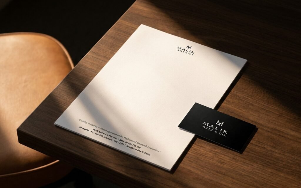
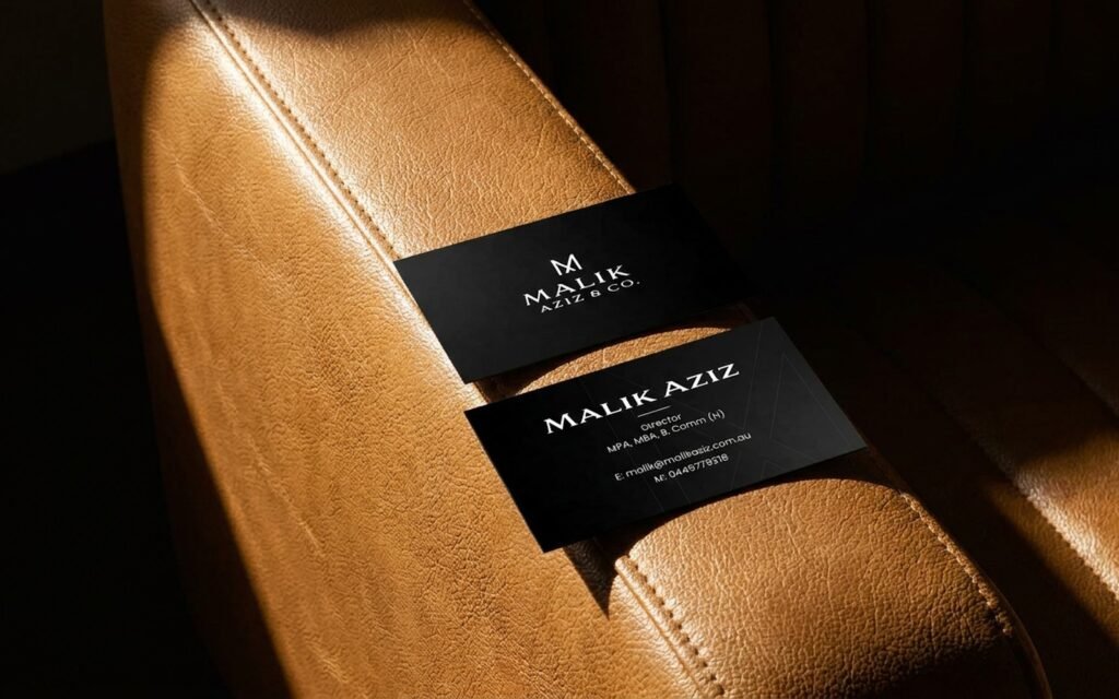
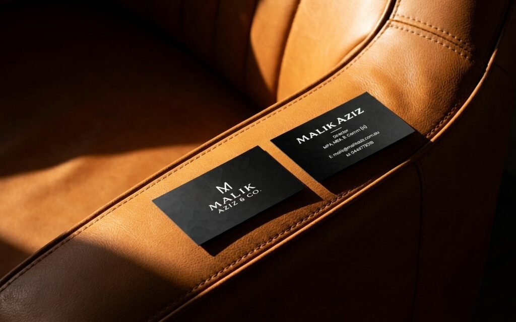
Black cards, white paper.
Matte black business cards carry the monogram on one side and a clean, centred contact block on the other. The letterhead keeps the logo small and lets an oversized, hairline M sit quietly in the background.