Case studyWelding and fabrication

DEPL: a weld spark, cut into a D
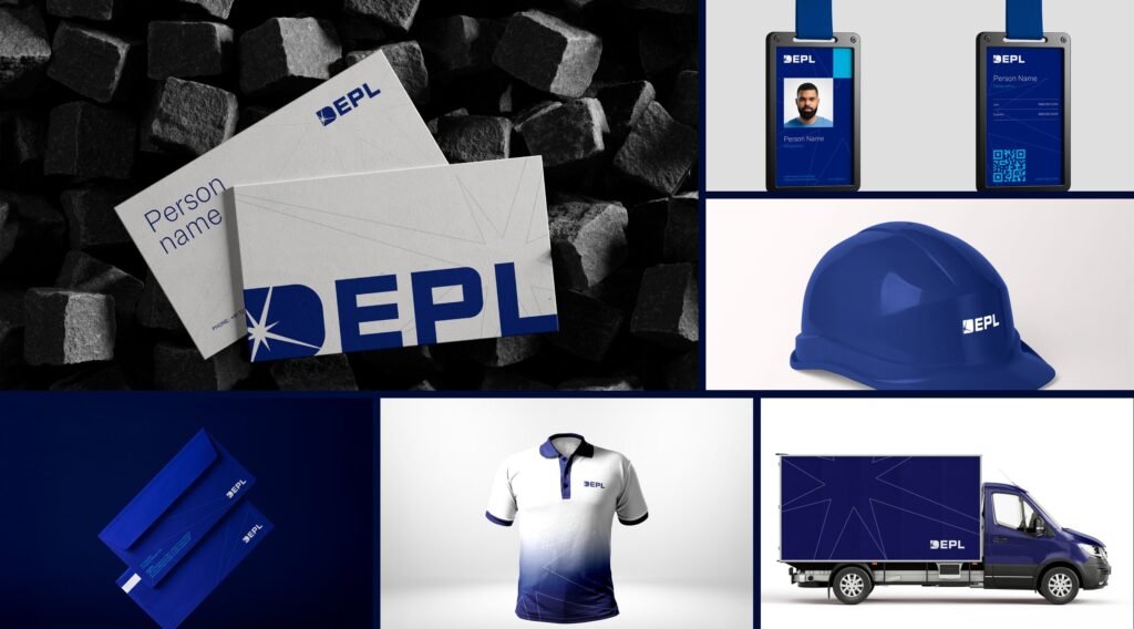
DEPL is a welding and fabrication company. ProfitPenny designed its identity around a weld spark cut into a D, then built out the guidelines and assets, from helmets and ID cards to fleet livery.
- Brand identity
- Guidelines
- Brand assets
Case study · Brand identity
DEPL
An identity for a welding and fabrication company, built from a single idea: the spark that joins steel.
- Client
- DEPL
- Scope
- Logo system, colour, typography, iconography, brand guidelines and brand assets
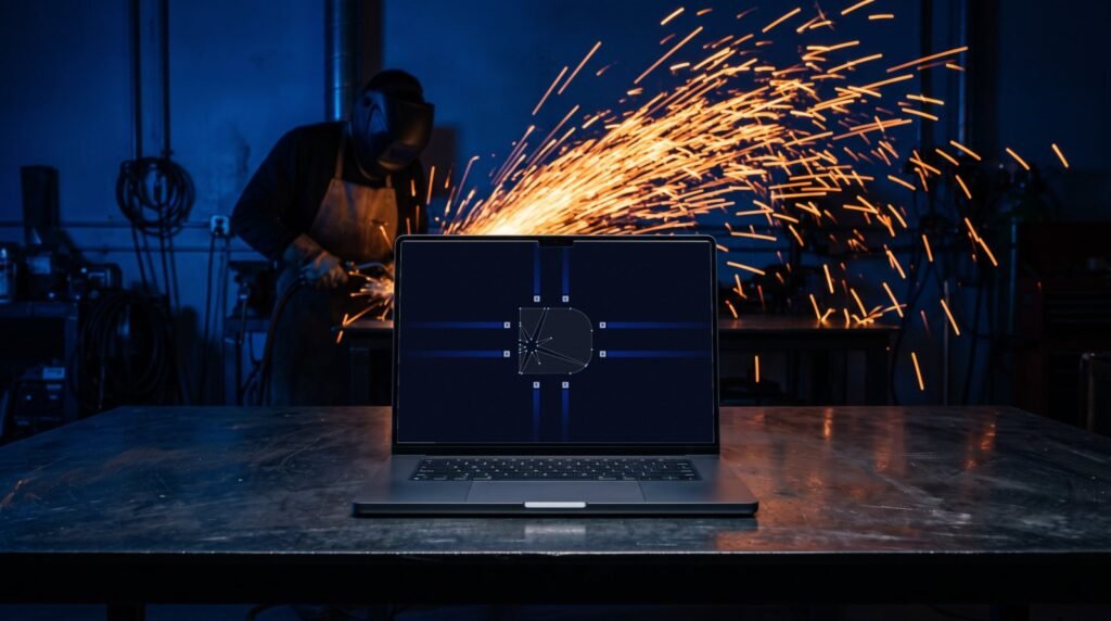
A weld spark, cut into the D.
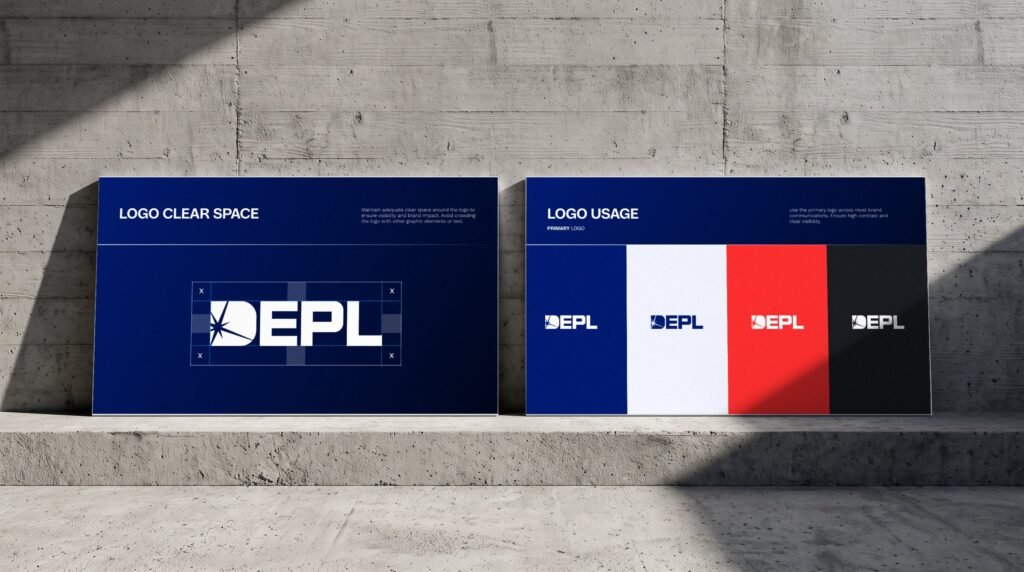
The spark is drawn on a strict grid and cut out of a heavy, rounded D. It works as a full wordmark, a monogram, or the spark alone where space is tight. Switch between them and try each on the brand colours.

Construction of the monogram
Bold, professional, modern.
One deep navy carries the brand. Charcoal and a cool white keep layouts clean, while a signal red and an arc-light cyan are used sparingly for emphasis. Tap a colour to copy its code.
Parabolica for impact. Work Sans for everything else.
Parabolica sets headlines and titles with an engineered, wide stance. Work Sans handles subheadings in SemiBold and body copy in Light, so technical content stays easy to read.
From the site office to the shop floor.
Stationery, ID cards, safety helmets, uniforms and fleet graphics, all built from the same spark and the same navy.