01Ishva
A stone brand drawn from the geometry of Jagannath.
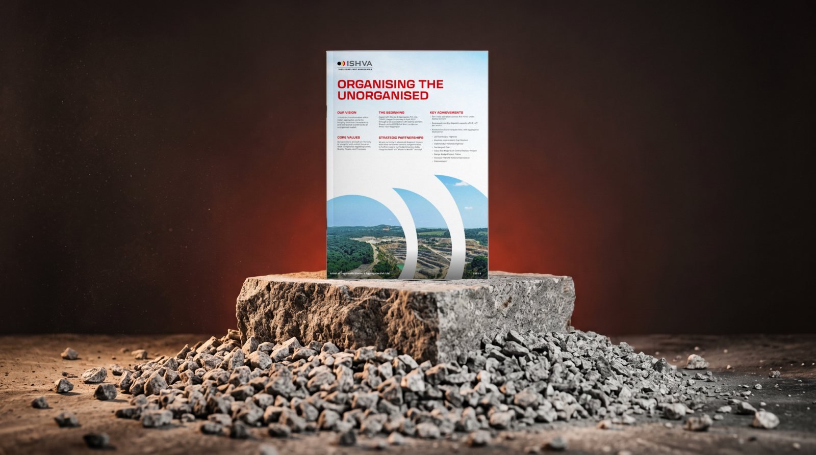
Name, mark and brand system for an aggregates company, carried through a bi-fold brochure, stationery and uniforms.
- Branding
- Logo story
- Brochure
- Merch
01Ishva
Name, mark and brand system for an aggregates company, carried through a bi-fold brochure, stationery and uniforms.
02IIMBAA
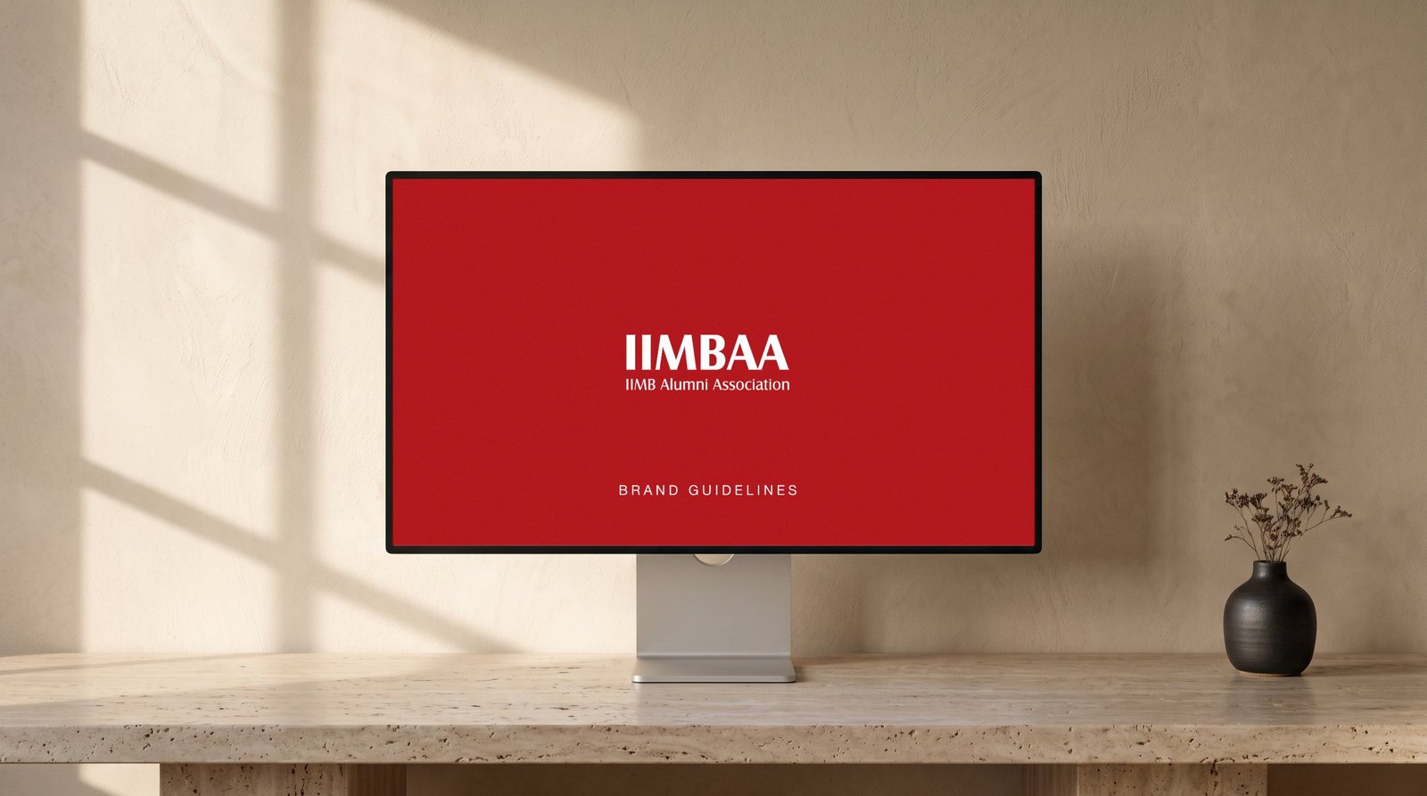
Guidelines that let chapters, events and partners use the identity without ever breaking it.
03DEPL
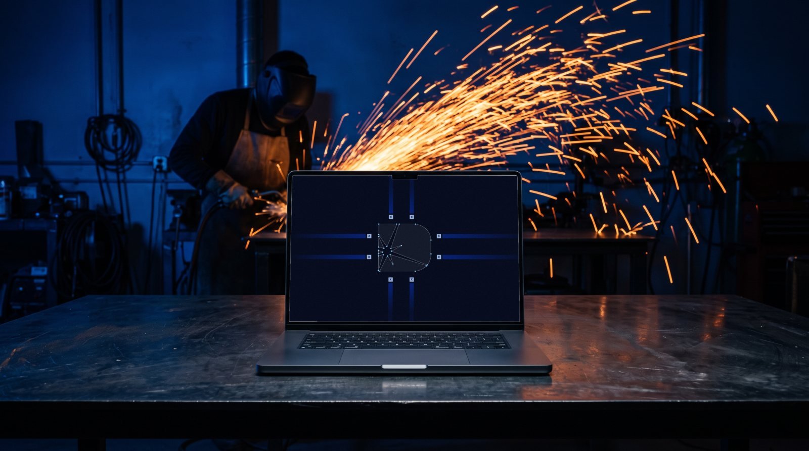
An identity for a welding and fabrication company, from logo construction to helmets, ID cards and fleet.
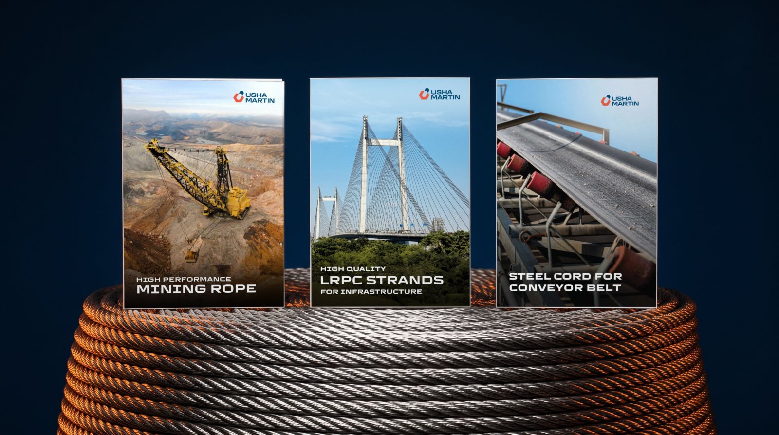
04Usha Martin
Four product brochures, an always-on social media calendar and an exhibition stall that all speak one language.
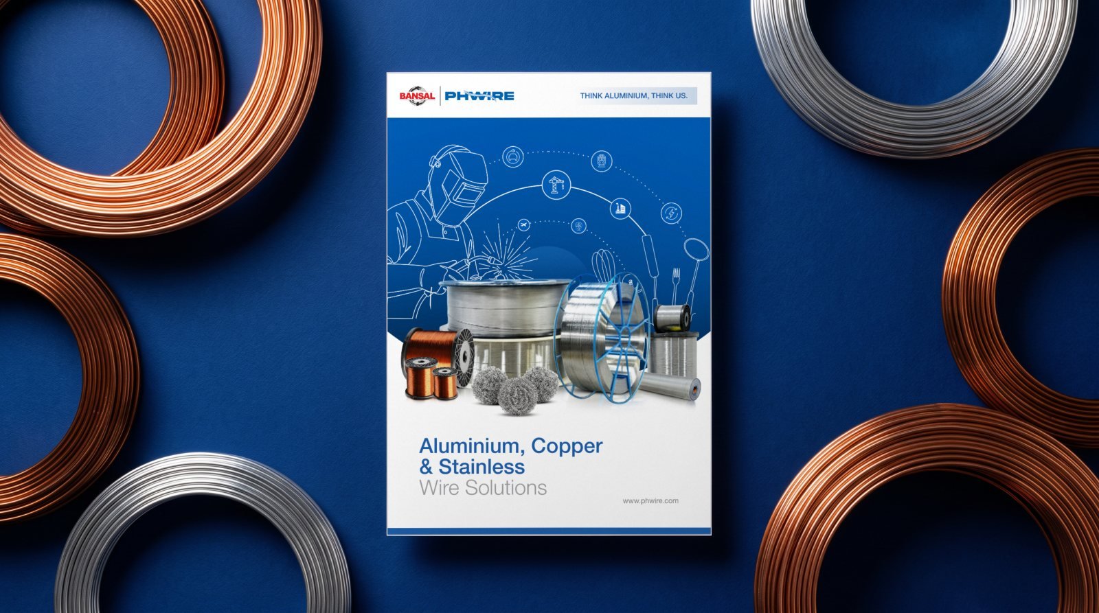
05PH Wire
Aluminium, copper and stainless wire, eight product lines, one clear page system.
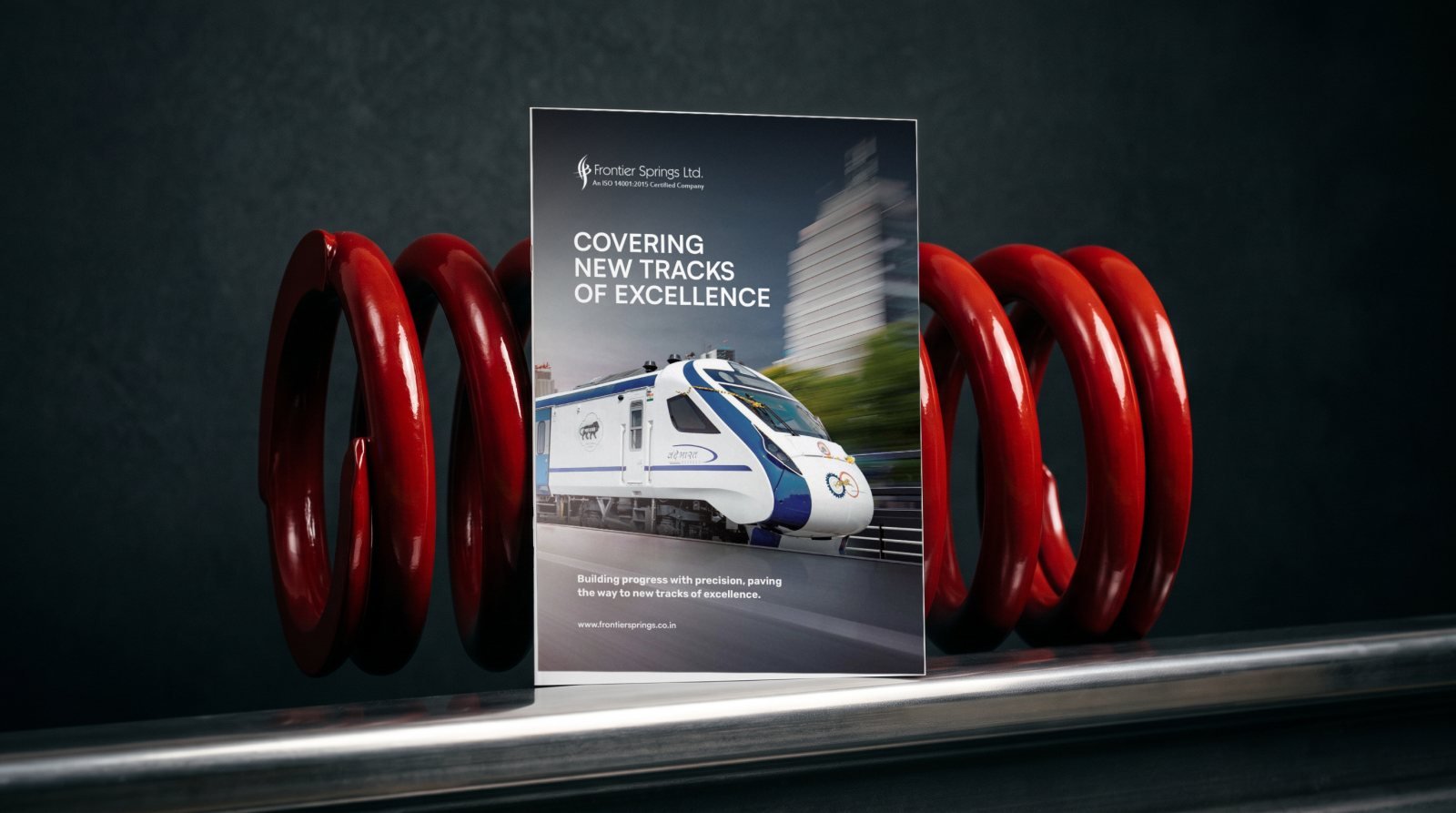
06Frontier Springs
Dark openers for each division and bright product pages for the parts they make.
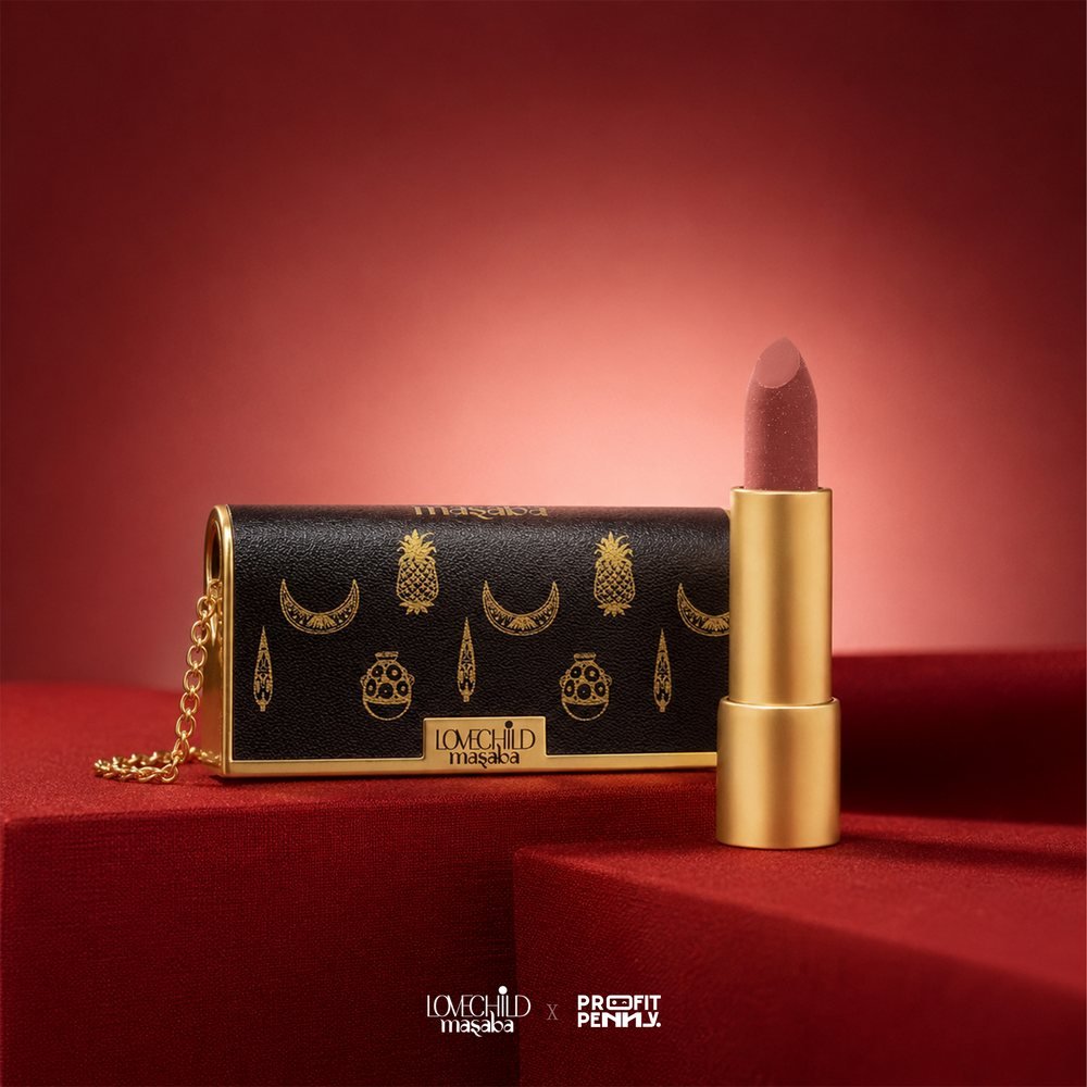
07Lovechild Masaba
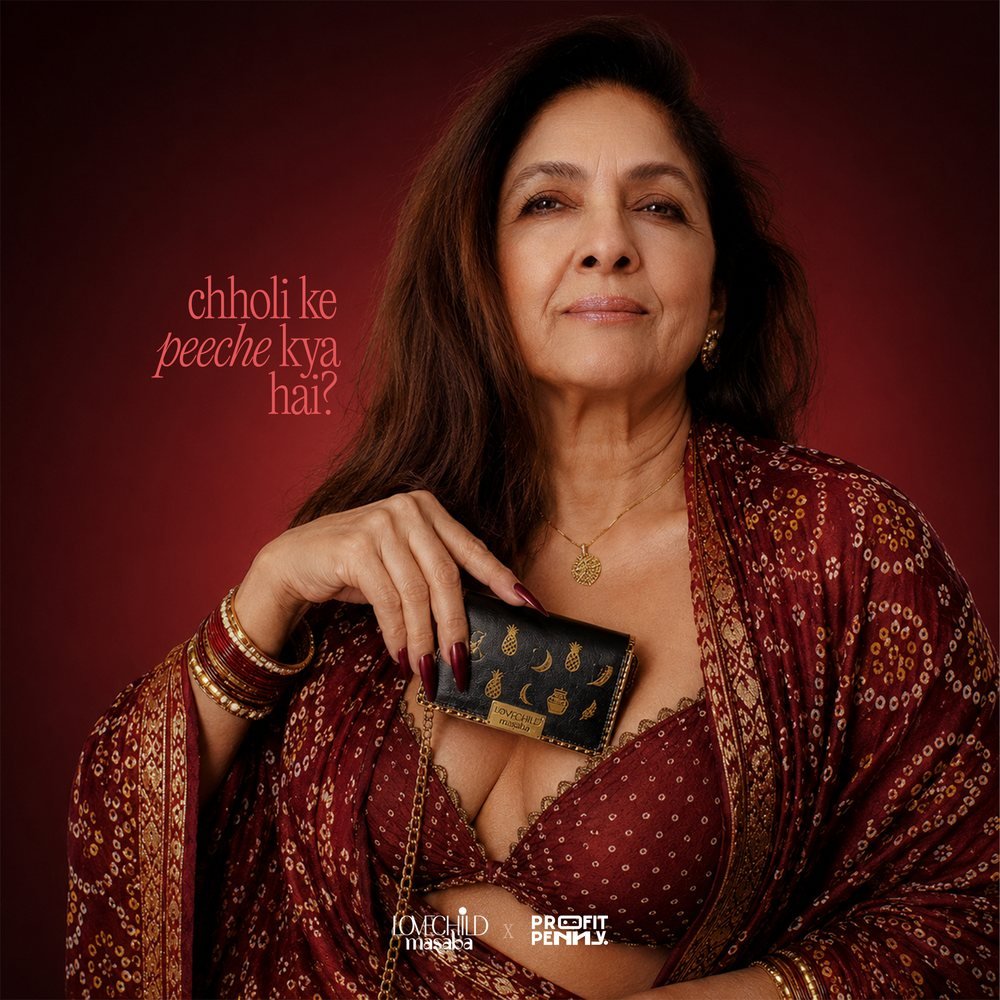
A social campaign of rich reds, gold and Hinglish wit that made a new shade feel like an heirloom.
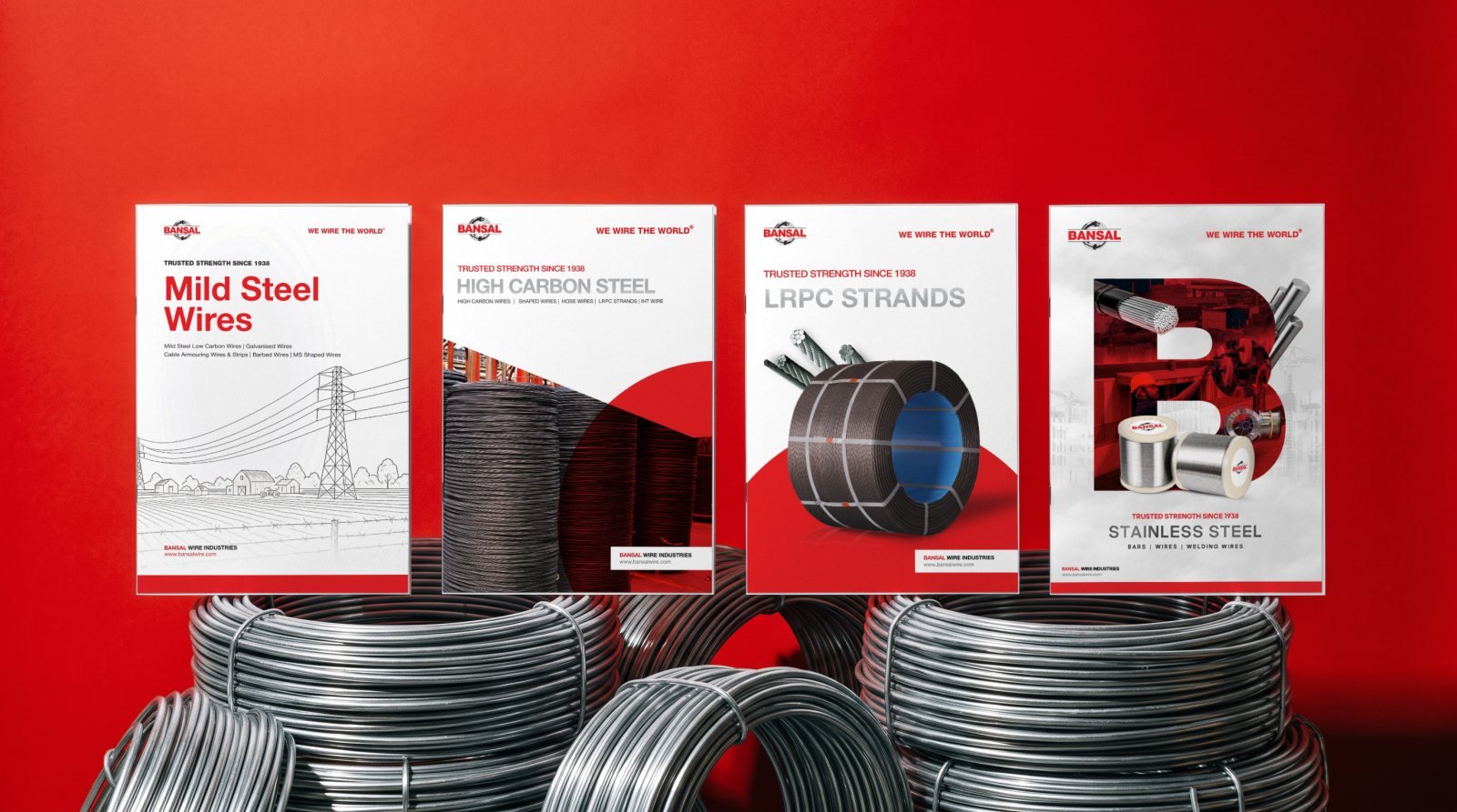
08Bansal Wire Industries
Mild steel, high carbon, LRPC and stainless steel, each with its own cover and the same clear structure inside.
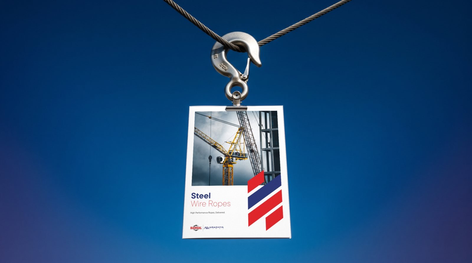
09Bansal Aradhya Steel
A technical catalogue that pairs dramatic rope photography with fast, scannable specification tables.
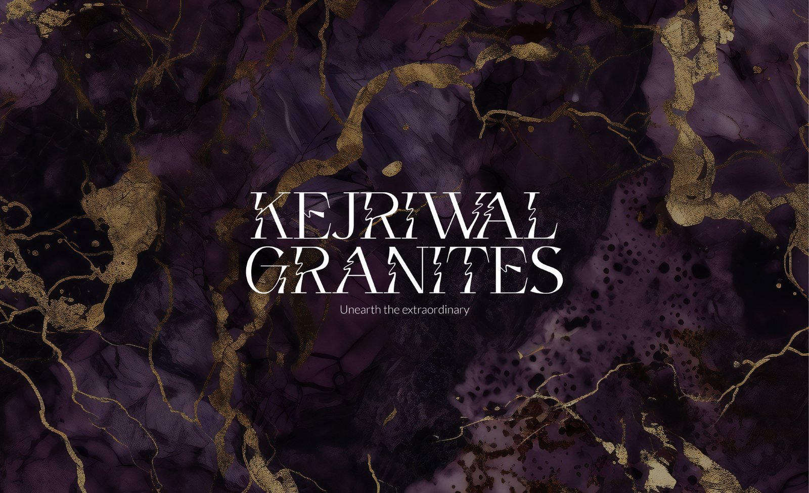
10Kejriwal Granites
Linear, faceted and couture: three ways to say "Unearth the extraordinary", each tested on fleet, uniforms and signage.
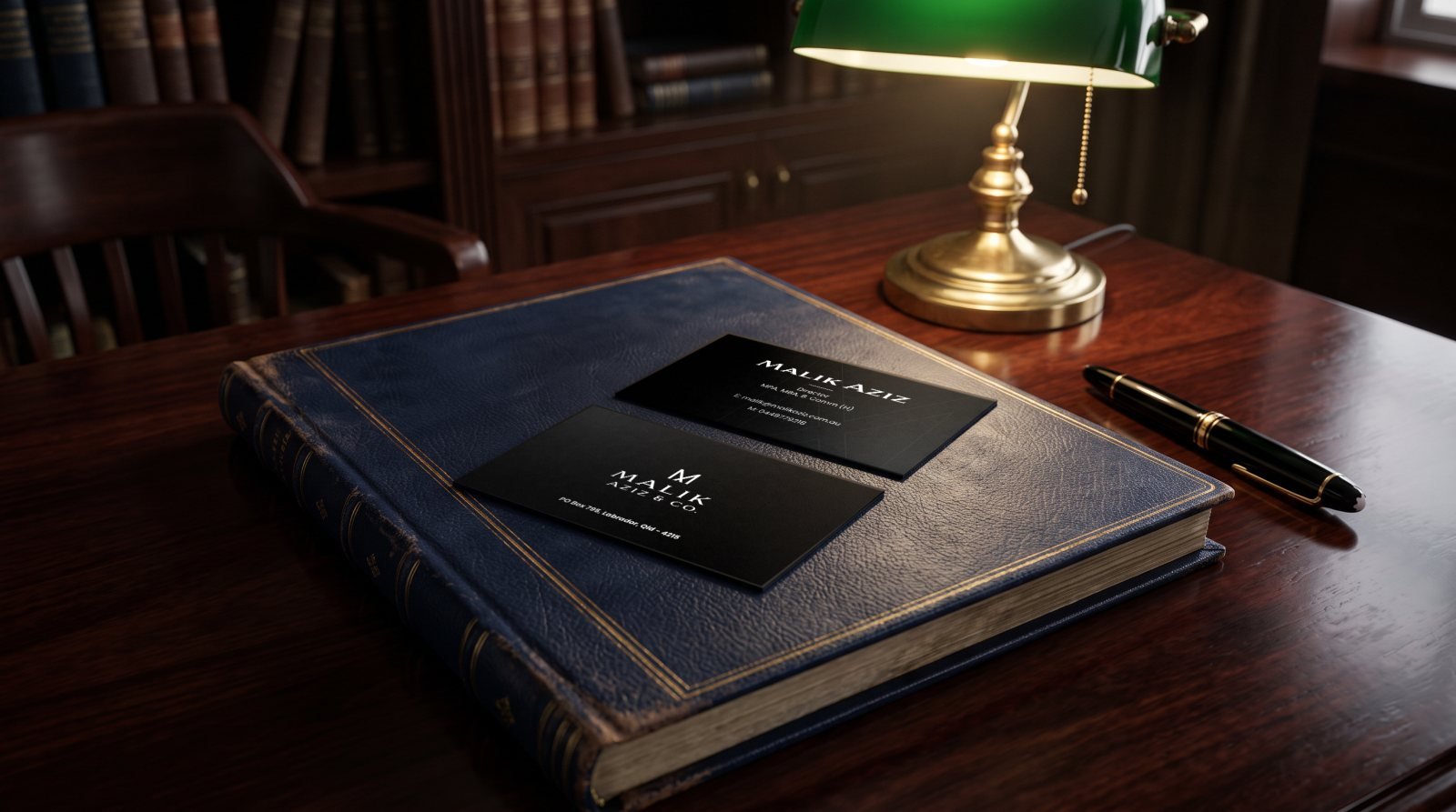
11Malik Aziz & Co.
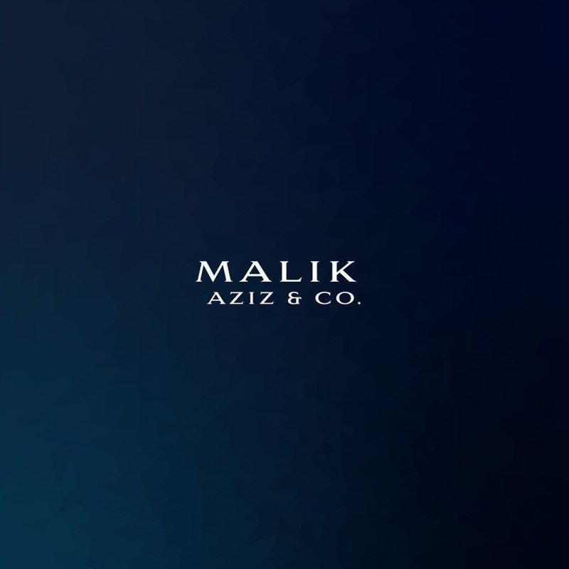
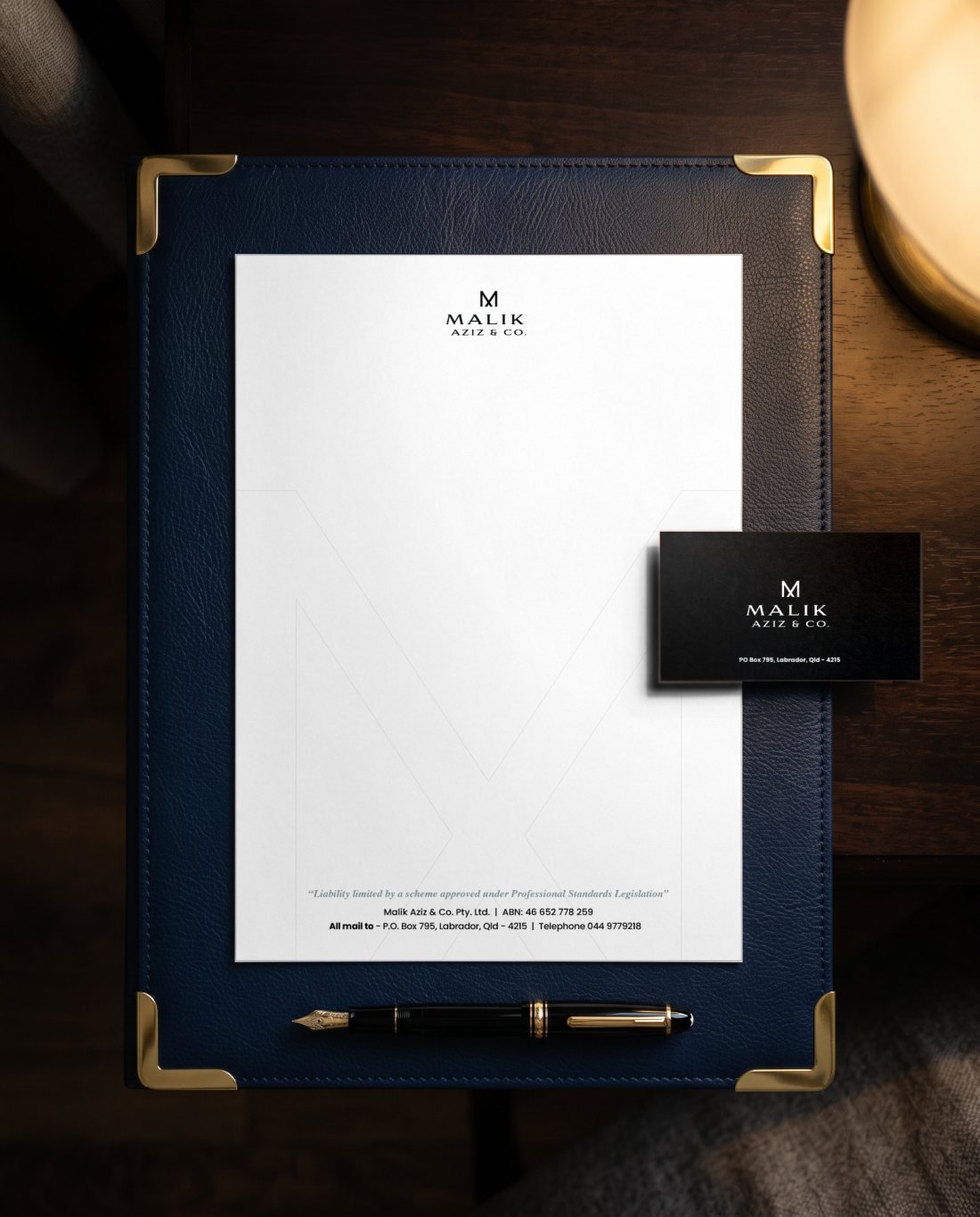
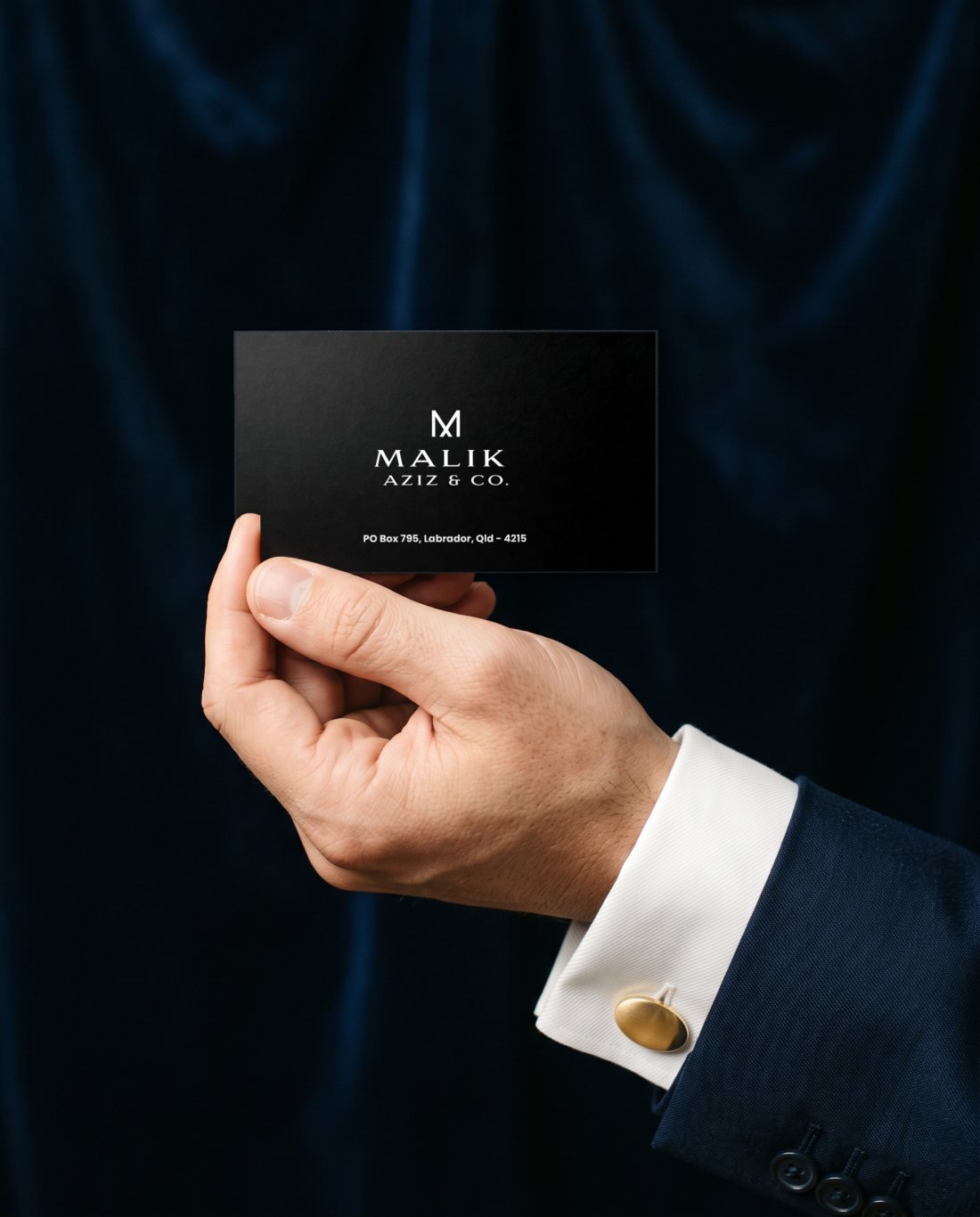
An MA monogram and wordmark, two colour routes, business cards and letterhead for a Gold Coast tax practice.
12Stewols Bansal
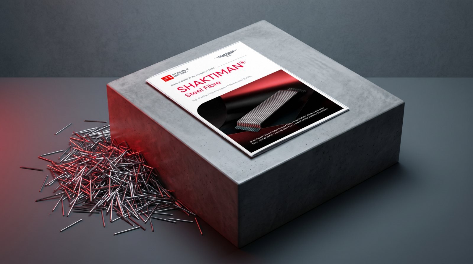
A brochure for SHAKTIMAN steel fibres that explains the science, the product range and where each one is used.
13Redseer
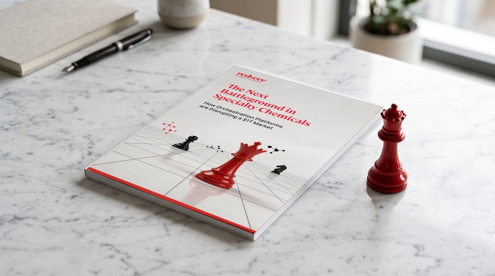
Reports and white papers where dense market data turns into clear charts, plus LinkedIn carousels that turn case work into thought leadership.
14The Curl Co.
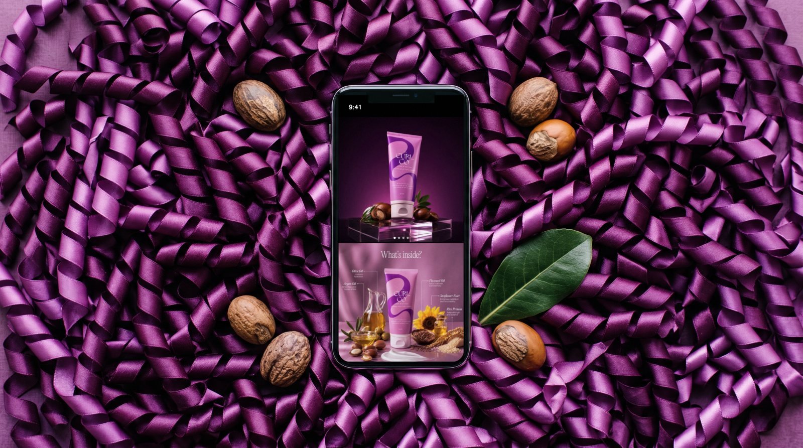
A before and after redesign of marketplace images: hero, ingredients, how to use and a curl type guide.
Featured case study · Brand identity
A name, a mark and a system to organise India's unorganised aggregates industry.
The mark draws from the Āmla, the ribbed stone crown of the Jagannath Temple in Puri. It stands for divine protection, resilience and rooted heritage: a fitting symbol for a company that supplies the stone India's infrastructure is built on.
The Āmla's layered, crescent-like form gave us the geometry. The temple's three presiding deities gave us the colours.
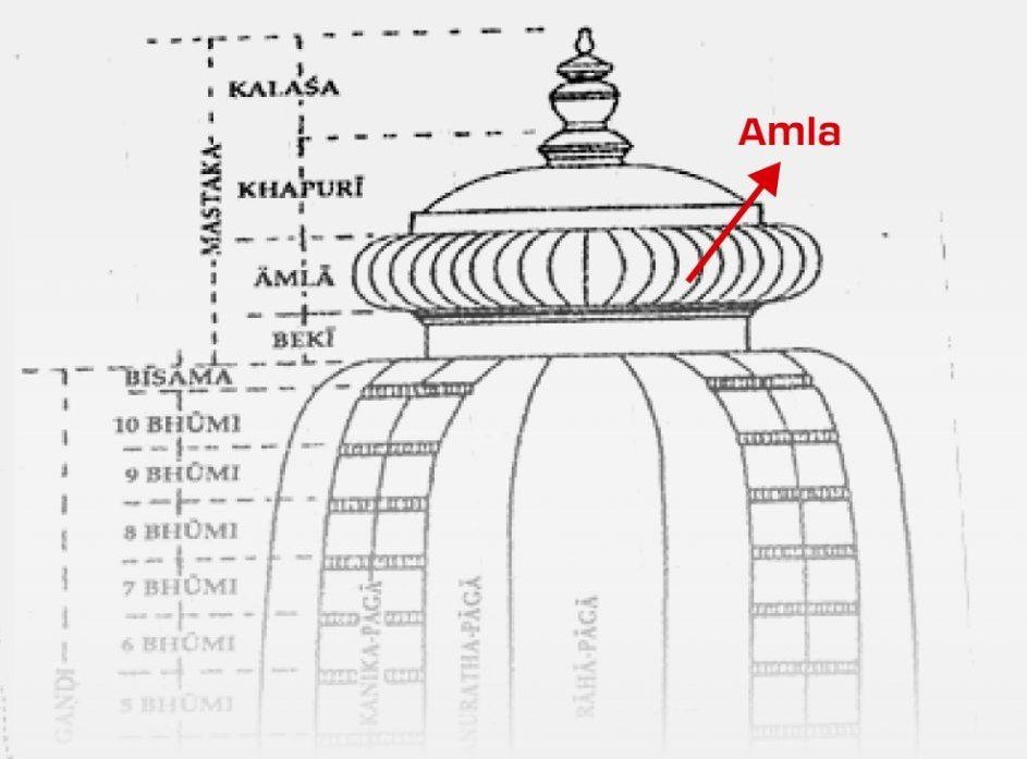
Āmla: the crown of the Jagannath Temple
Each shape carries one of the Jagannath trinity. Together they read as a single, forward-moving mark inspired by divine energy.

Lord of the Universe. The core vision that anchors the business.
The elder brother. Strength and power.
The sister. Shubh aur mangal: the auspicious value the work creates.
From the Sanskrit root “Ish”, to govern. The name casts Ishva as an organising force in a fragmented industry: bringing discipline, control and structure to operations long defined by chaos.
Short, modern and global, it marks the shift from commodity supplier to infrastructure partner.

Bi-fold brochure: cover, inside spread and back. Tap either page or swipe to flip.
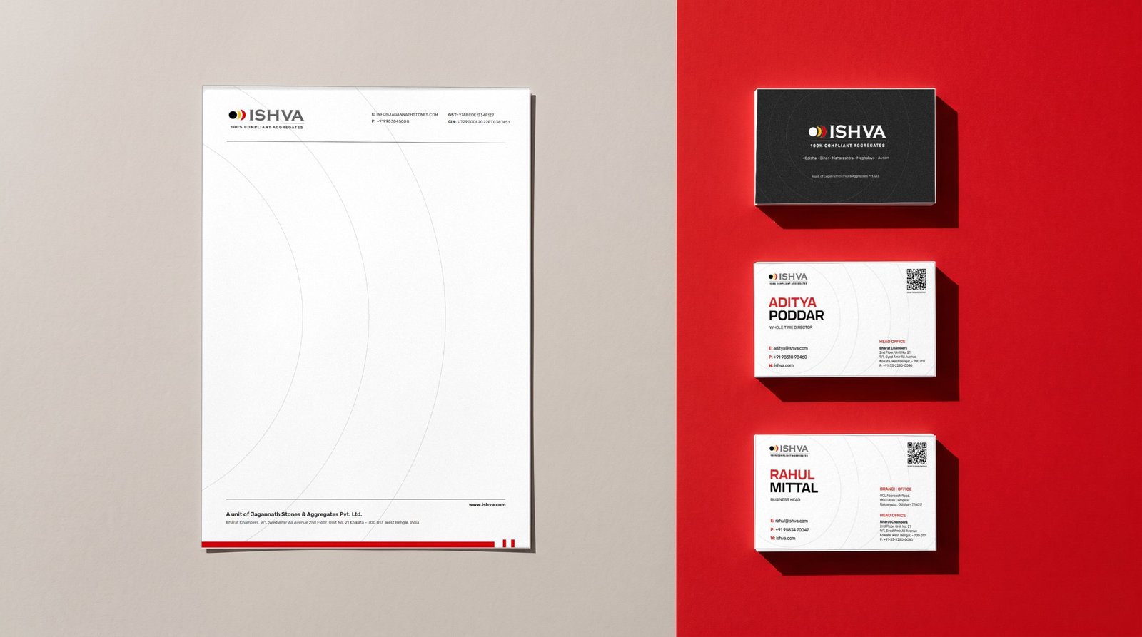
Letterhead and business cards
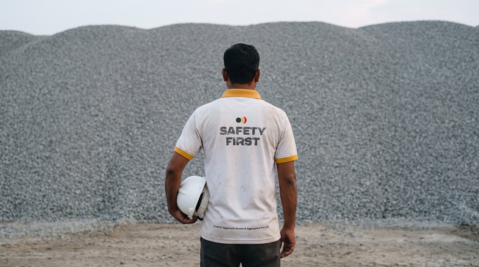
Site uniform, back
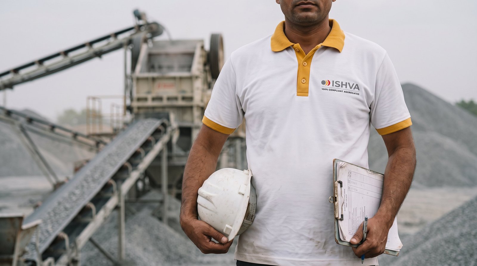
Site uniform, front
Case study · Brand guidelines
One brand system for the IIM Bangalore Alumni Association, built to flex across chapters, partners and events.
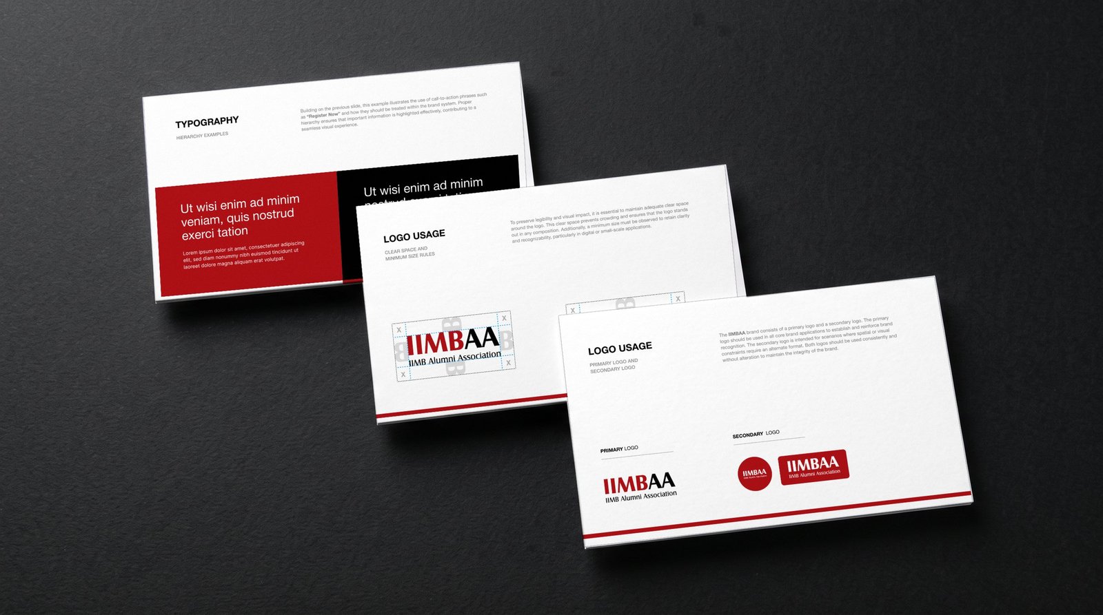
The primary logo leads every core application. Two secondary formats, a roundel and a block, take over where space is tight, such as social avatars, stage screens and merchandise. Generous clear space keeps it confident in any layout.


Red and black convey professionalism, energy and authority. Three greys support layouts without competing, and two curated gradients add depth on screen. Tap a colour to copy its code.
A modern, neutral pairing chosen for clarity at every size, from event stage screens to membership emails. Clear hierarchy rules cover headings, body copy and calls to action like “Register Now”.
Chapters get their own lockup without diluting the core identity: fixed proportions, a hairline rule and the chapter name set in the brand red. Try it with any chapter.
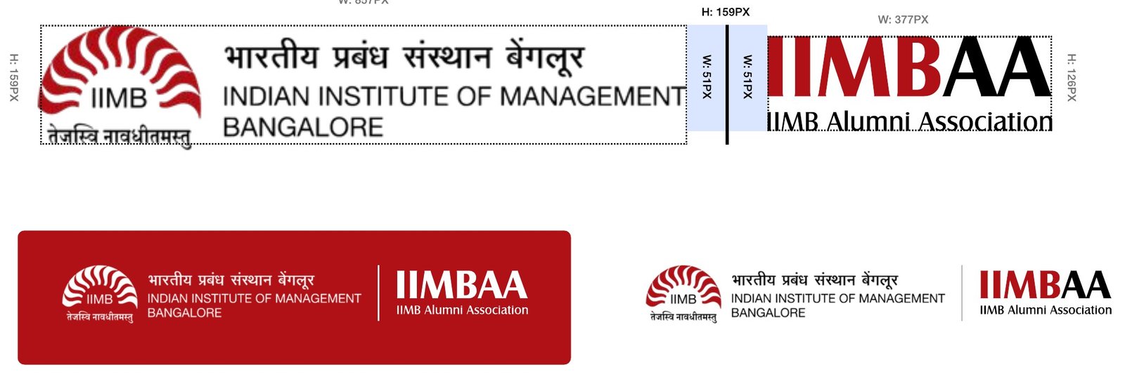
Placement alongside IIM Bangalore
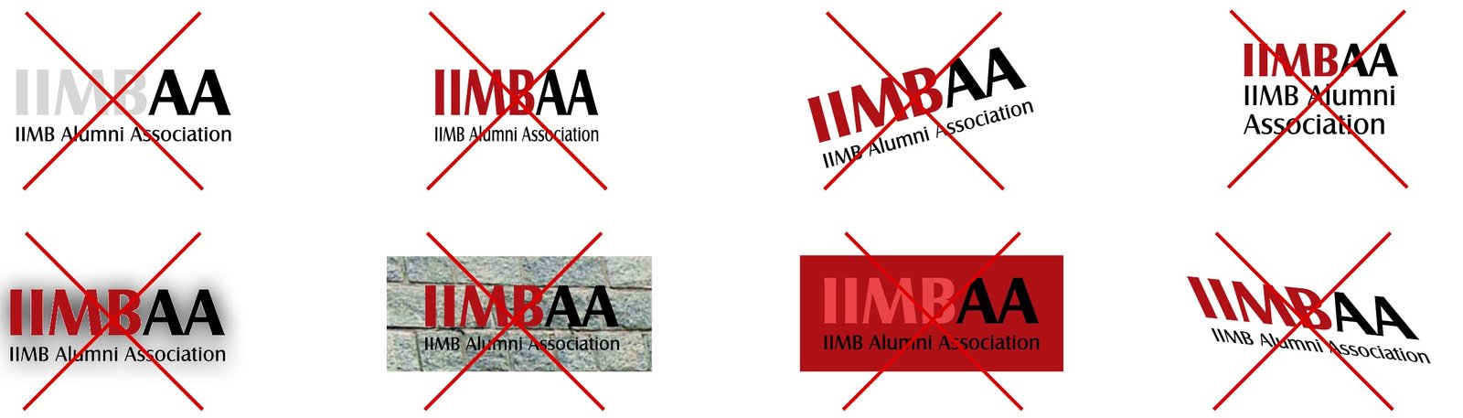
What never to do with the logo
Case study · Brand identity
An identity for a welding and fabrication company, built from a single idea: the spark that joins steel.
The spark is drawn on a strict grid and cut out of a heavy, rounded D. It works as a full wordmark, a monogram, or the spark alone where space is tight. Switch between them and try each on the brand colours.
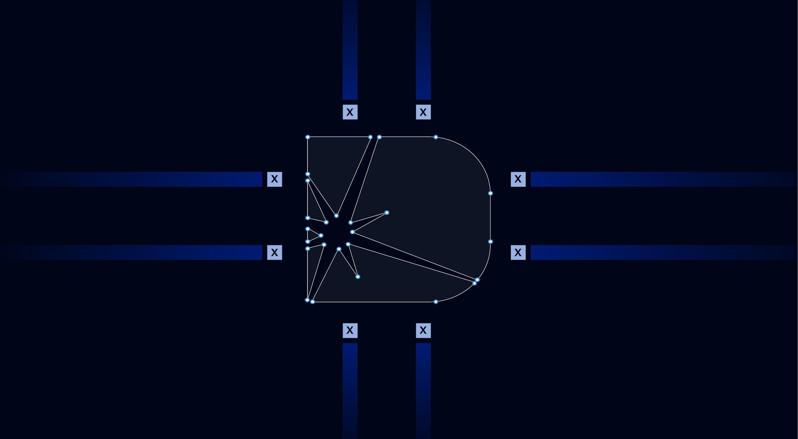
Construction of the monogram
One deep navy carries the brand. Charcoal and a cool white keep layouts clean, while a signal red and an arc-light cyan are used sparingly for emphasis. Tap a colour to copy its code.
Parabolica sets headlines and titles with an engineered, wide stance. Work Sans handles subheadings in SemiBold and body copy in Light, so technical content stays easy to read.
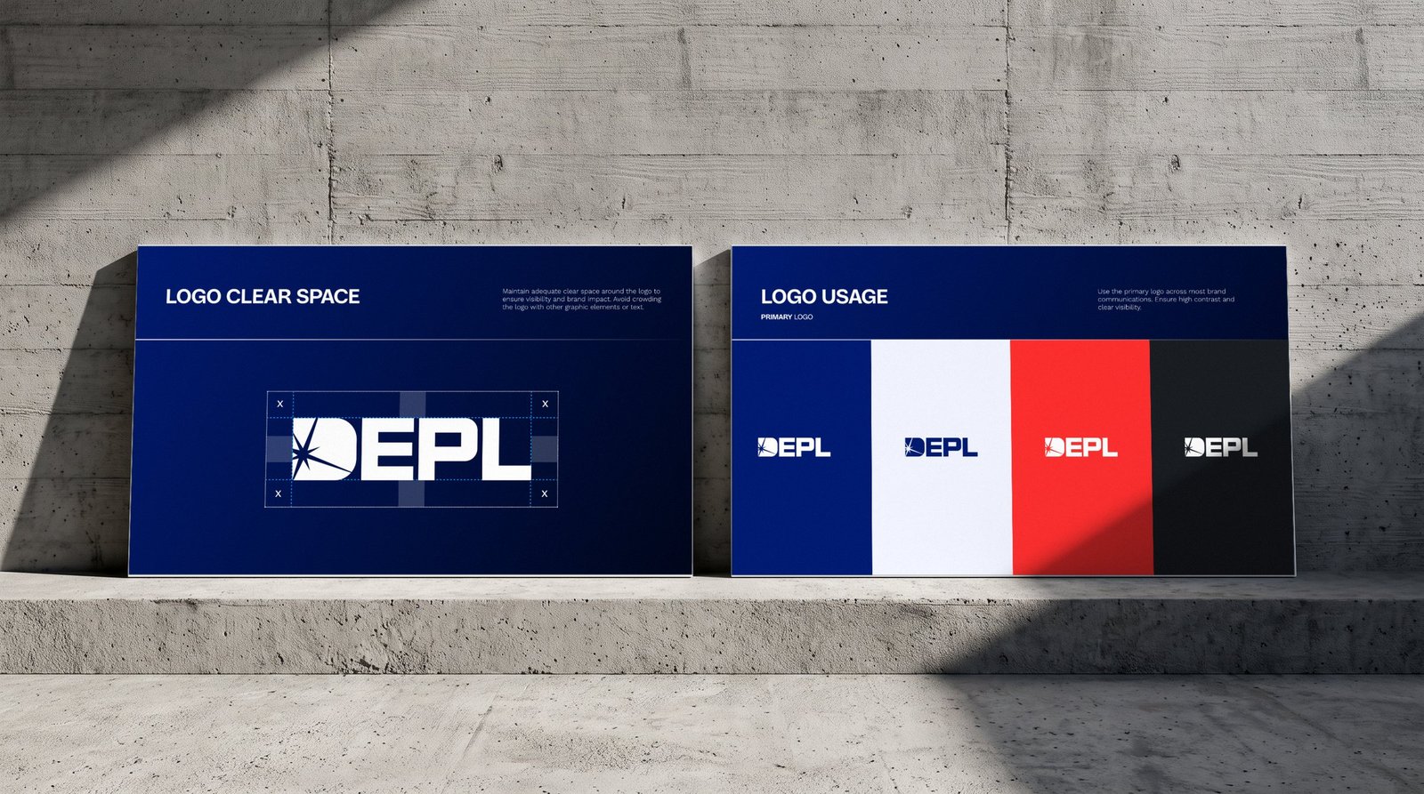
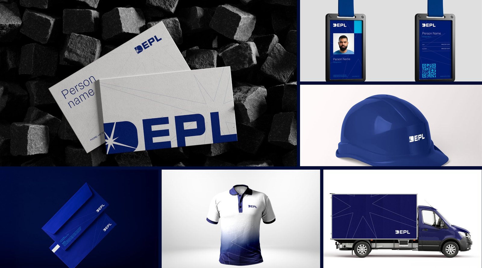
Stationery, ID cards, safety helmets, uniforms and fleet graphics, all built from the same spark and the same navy.
Case study · Product brochure
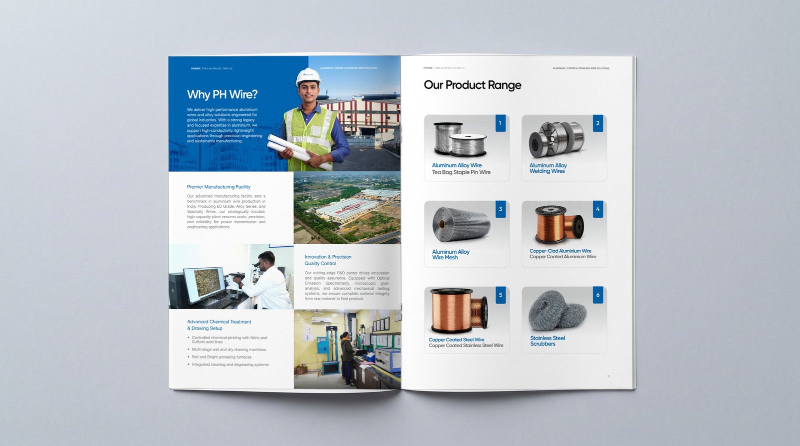
A 24-page product brochure for Bansal Wire's aluminium, copper and stainless wire range. Think aluminium, think us.
Every product gets the same rhythm: a blue hero panel, a clear specification table, grades, applications and packaging. Buyers can compare wires at a glance, and the brand holds together across eight product lines. Use the arrows, the dots or your keyboard.
Case study · Corporate brochure
Covering new tracks of excellence. A corporate brochure for a railway components maker that has supplied Indian Railways since 1981.
The brochure is structured around the company's growth, from laminated springs to hot coiled springs, forging and air suspension. Each division opens with a full-bleed image and a short, confident story, followed by a clean product page.
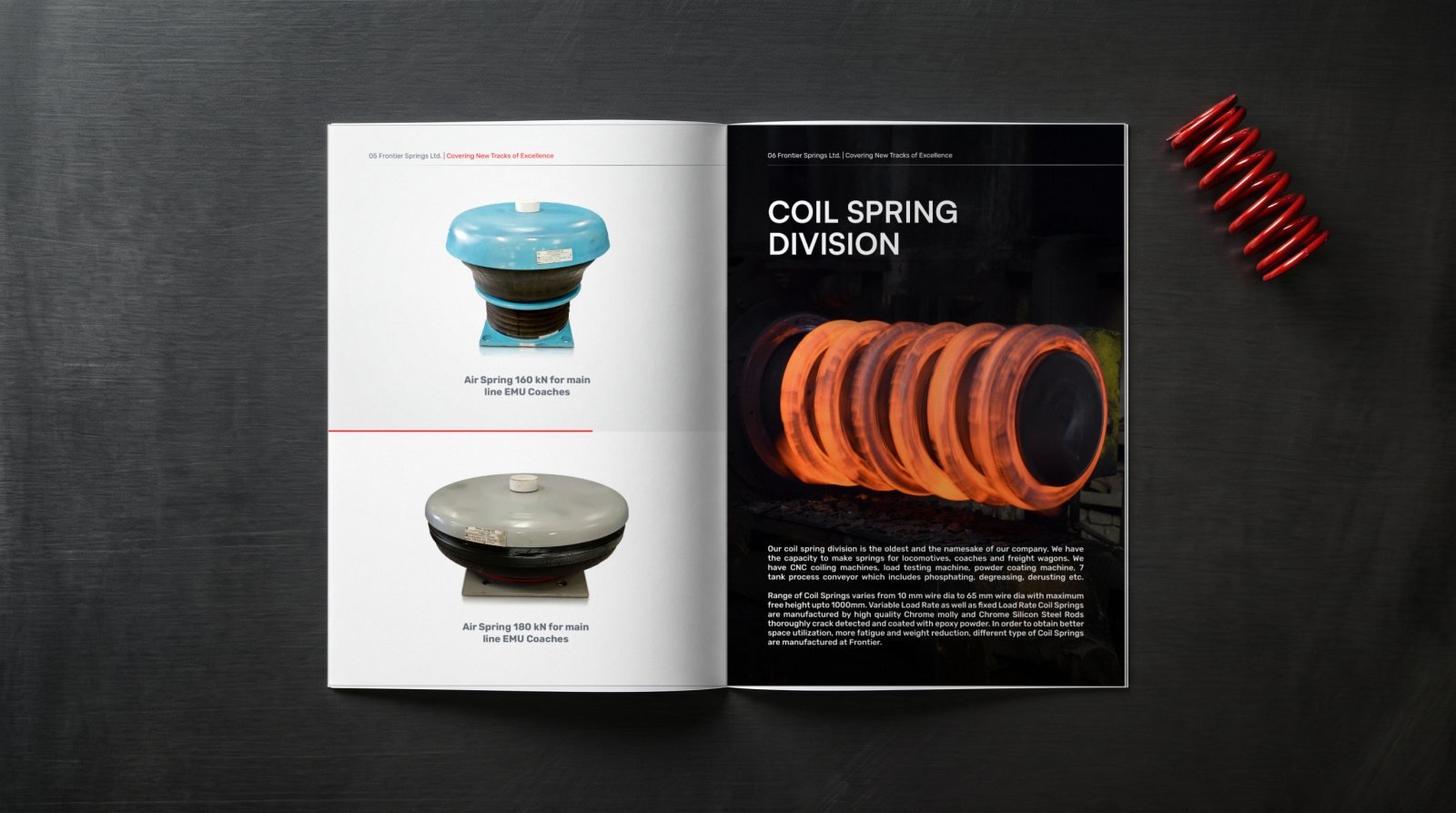
A simple rhythm keeps twelve pages easy to follow: dramatic, dark openers for each division and bright, catalogue-style pages for the parts. Flip through the full brochure, spread by spread.
Case study · Brochures, social media, exhibition
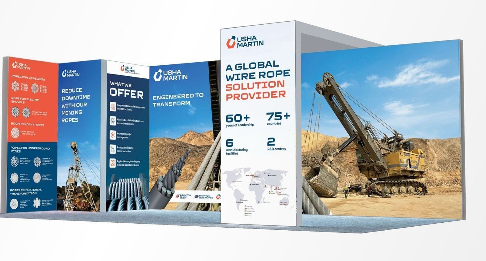
One of the world's leading wire rope makers, with a product library to match. We design the brochures, run the social feed and build the stall.
Mining rope, LRPC strands for infrastructure and steel cord for conveyor belts each got a bold photographic cover and a shared inner system: a global footprint spread, capability pages and dense specification tables that stay easy to scan.
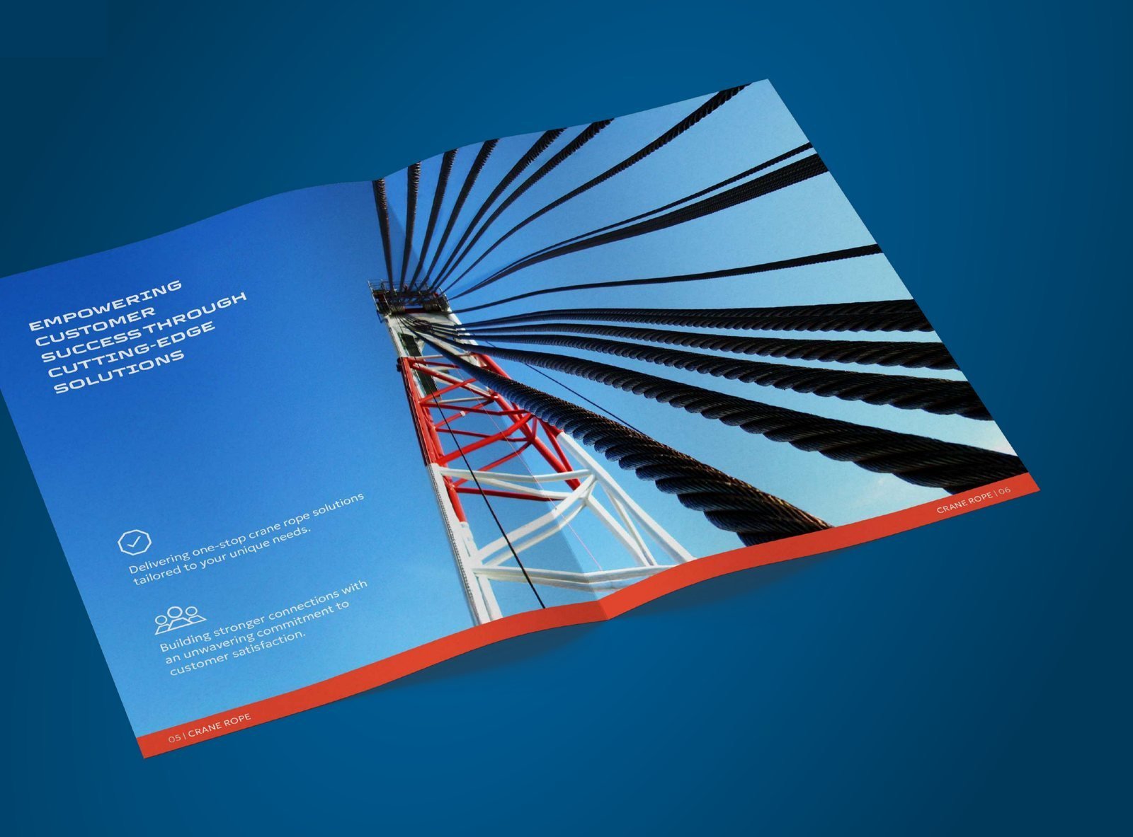
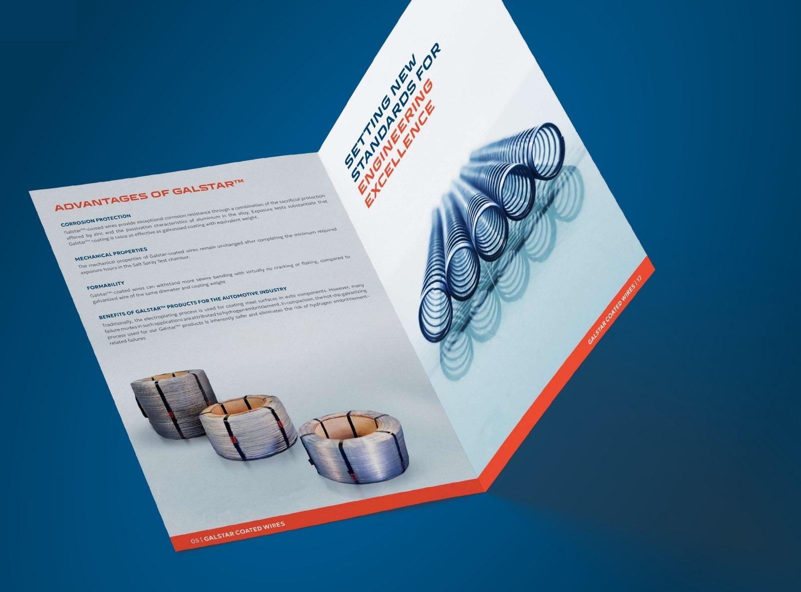
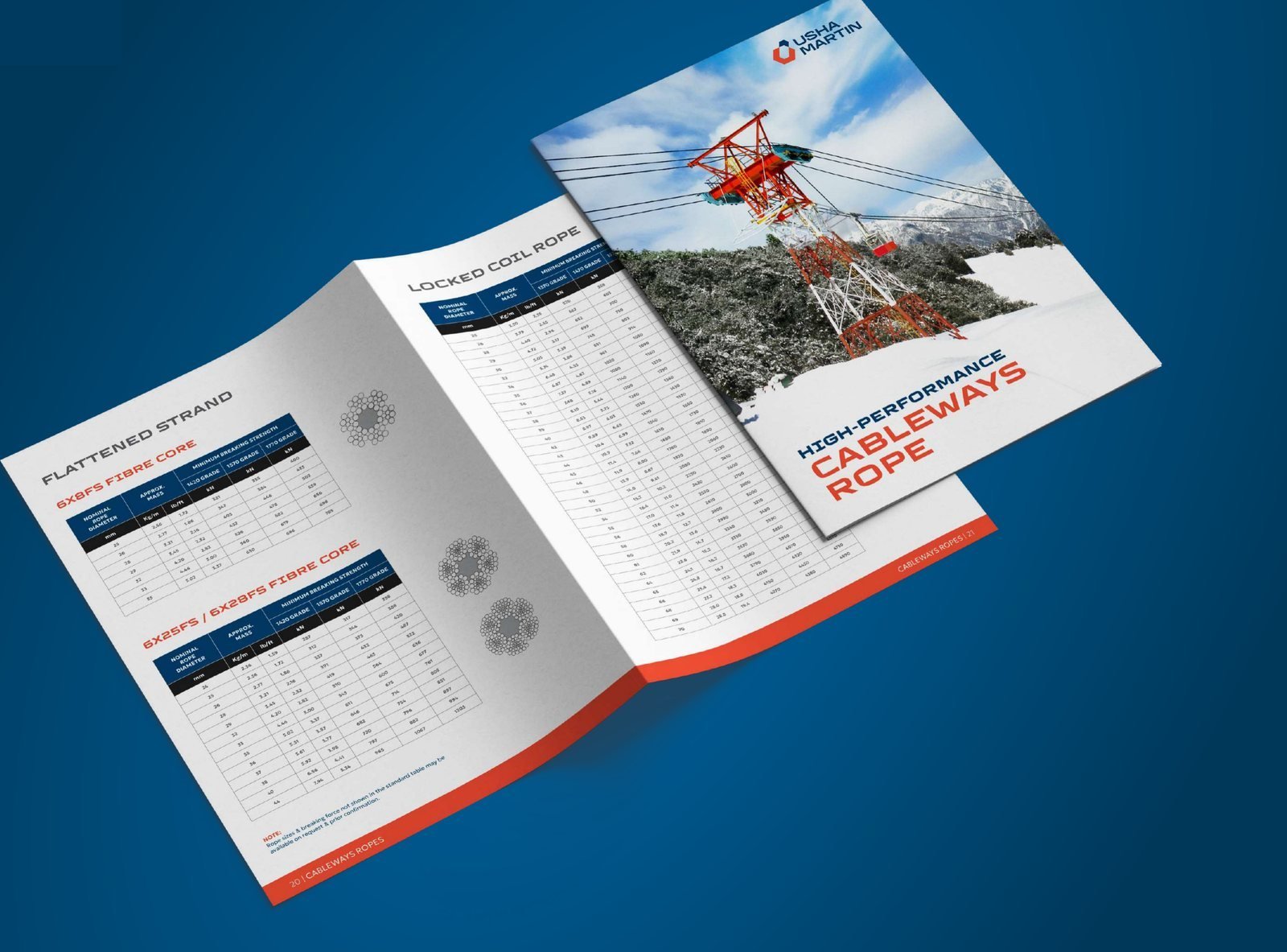
Pick a title, then flip through it spread by spread, just as it prints. Use the arrows, tap either page or swipe.
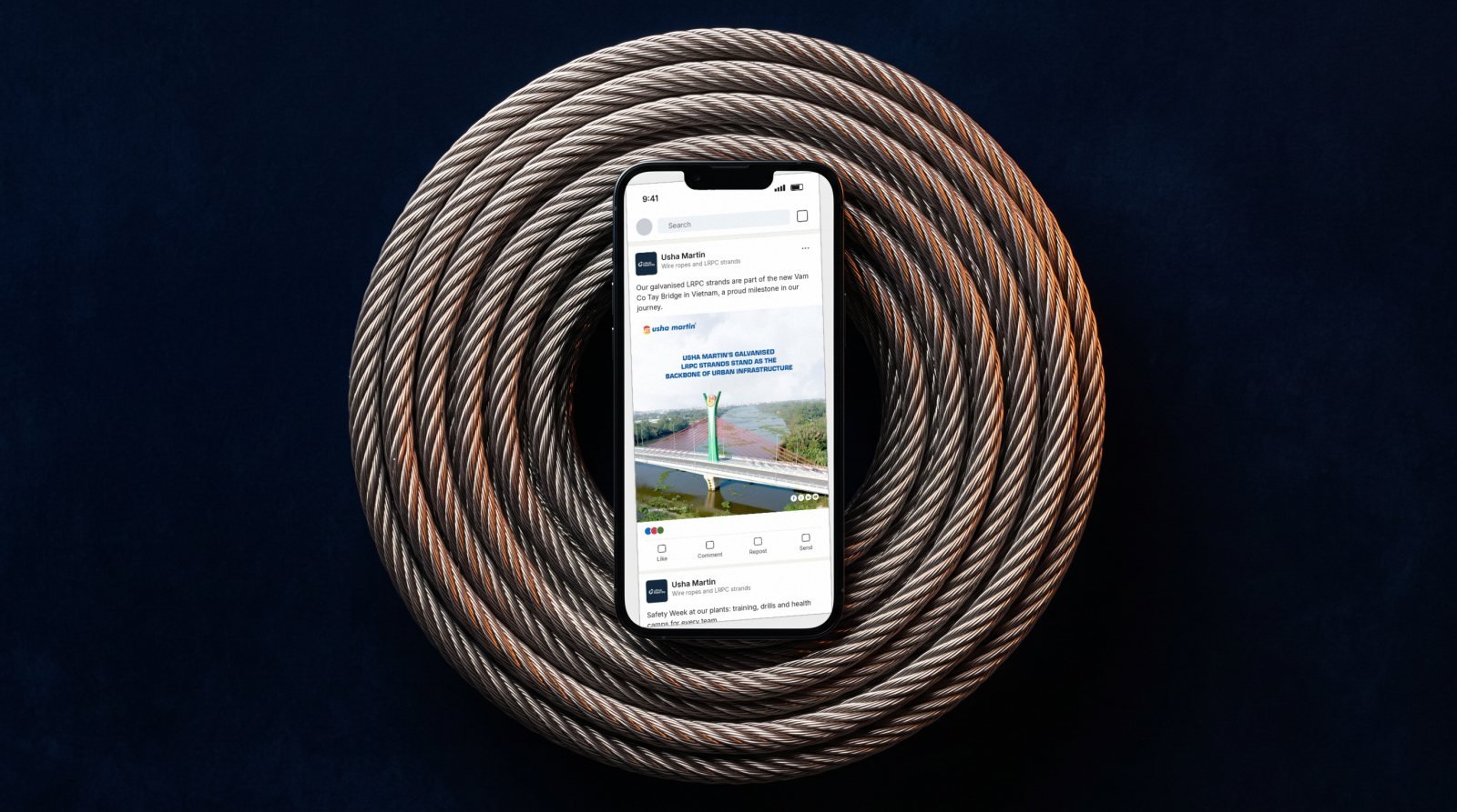
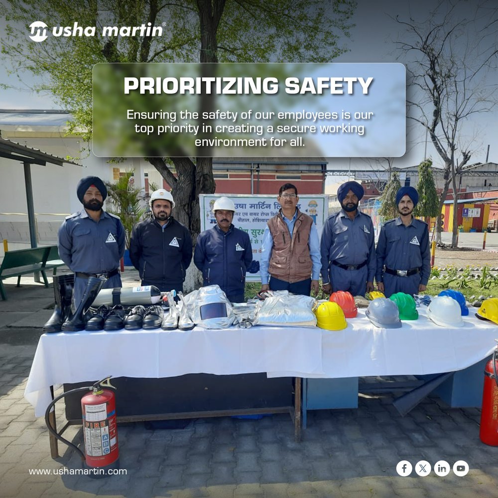
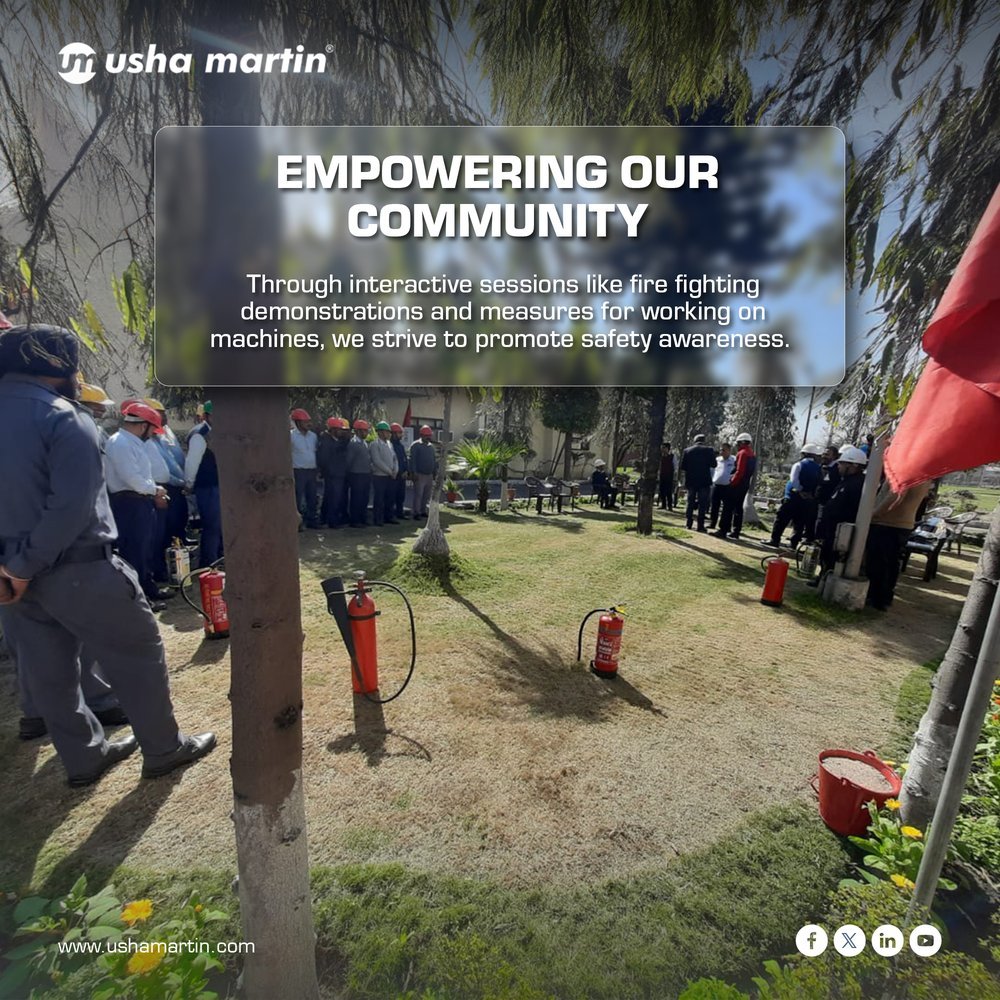
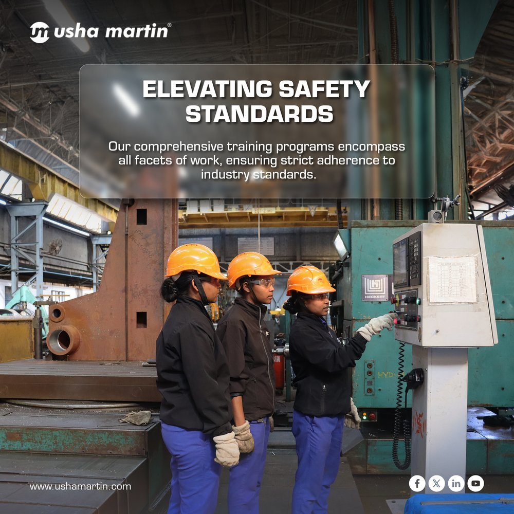
We plan and design Usha Martin's social calendar: project stories like the Vam Co Tay Bridge in Vietnam, trade show invites, safety campaigns and festive moments, all in one recognisable system of big headlines, real site photography and the brand's blue and orange.
Carousel · World Day for Safety
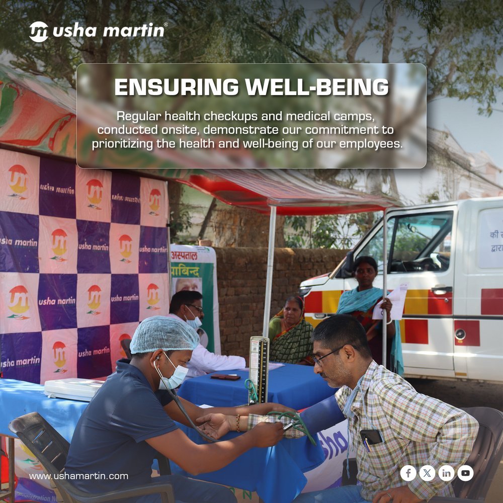

From the feed
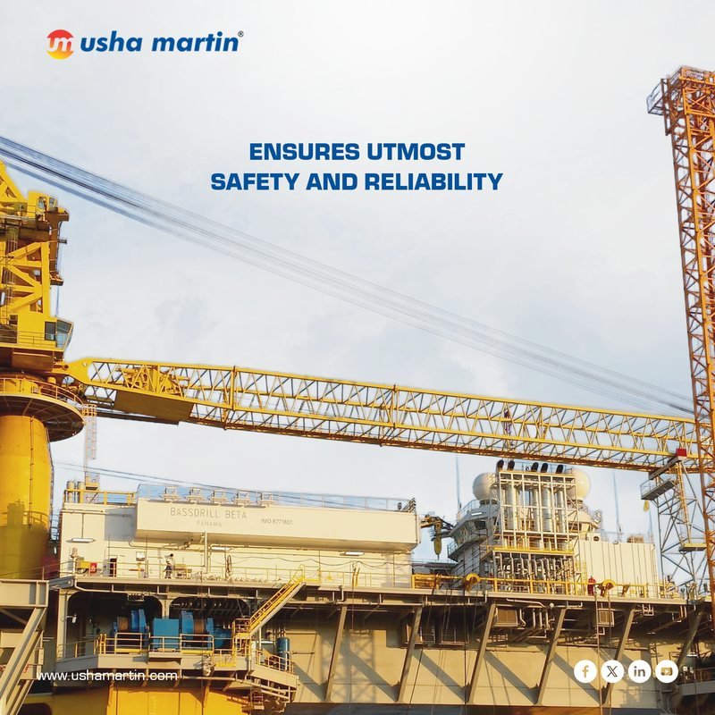
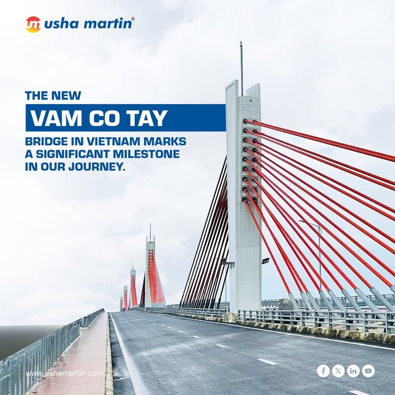
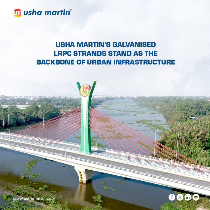
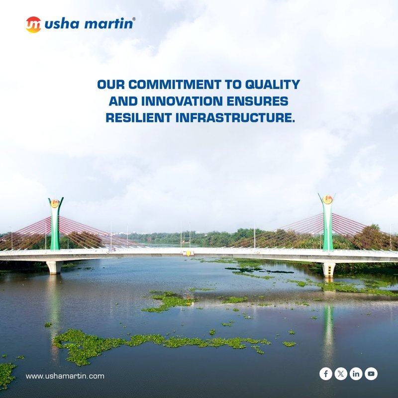
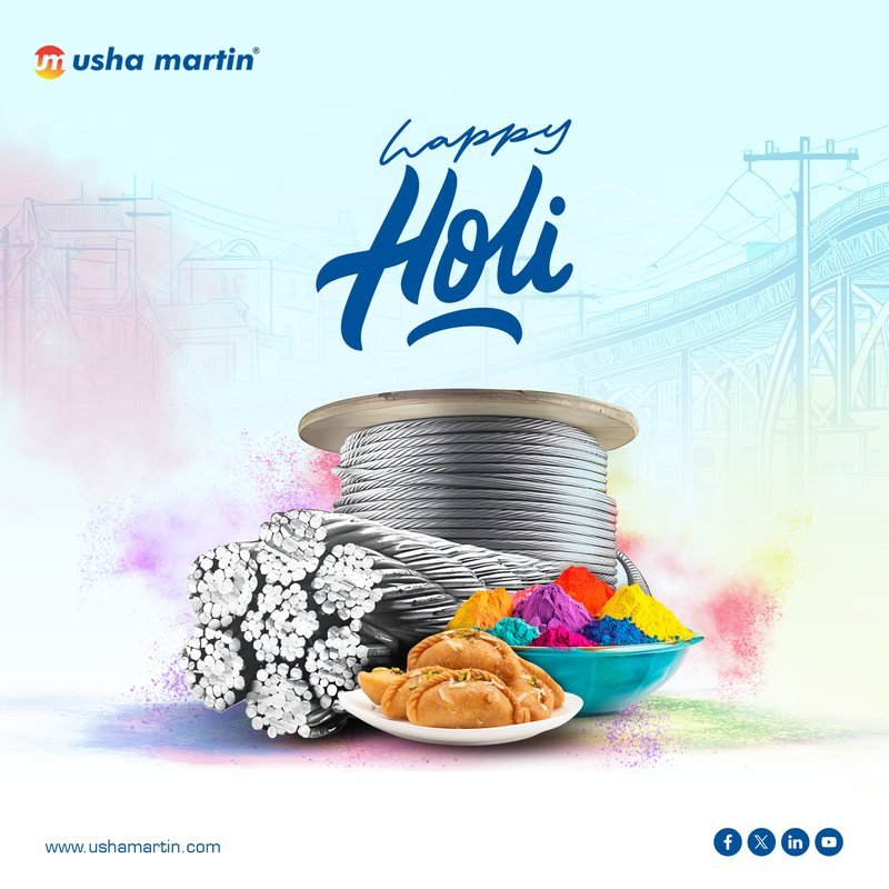
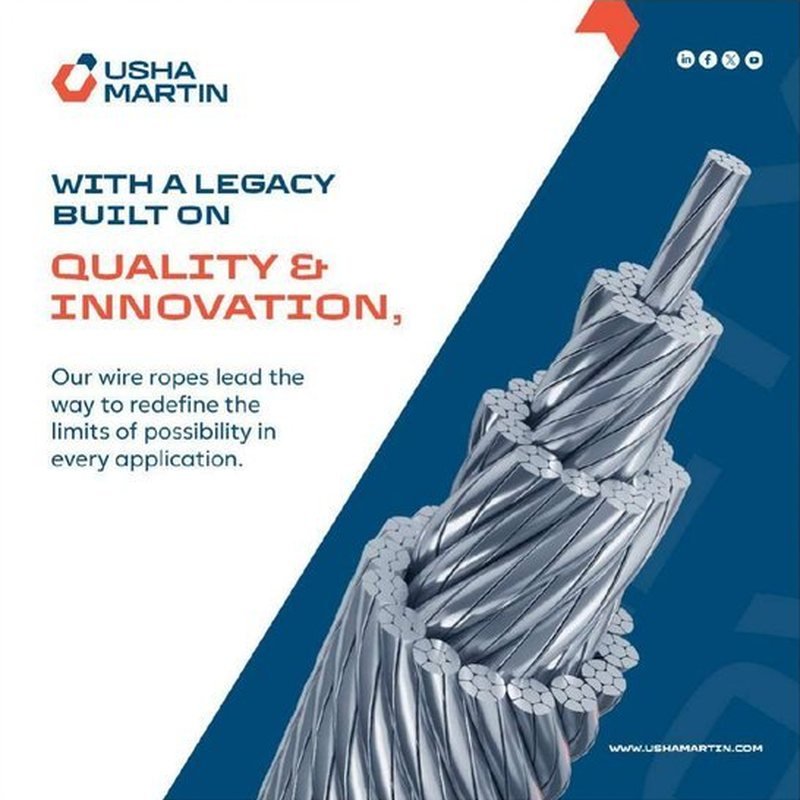
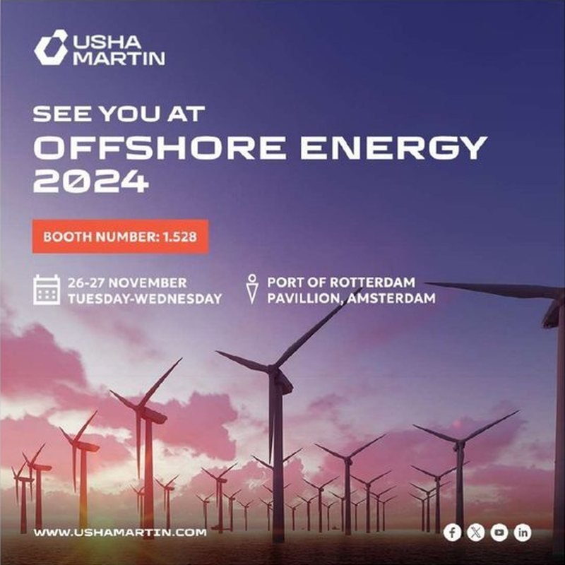
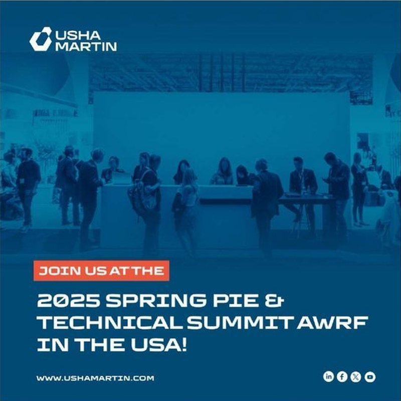
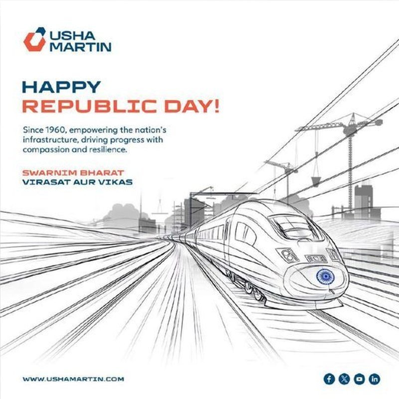
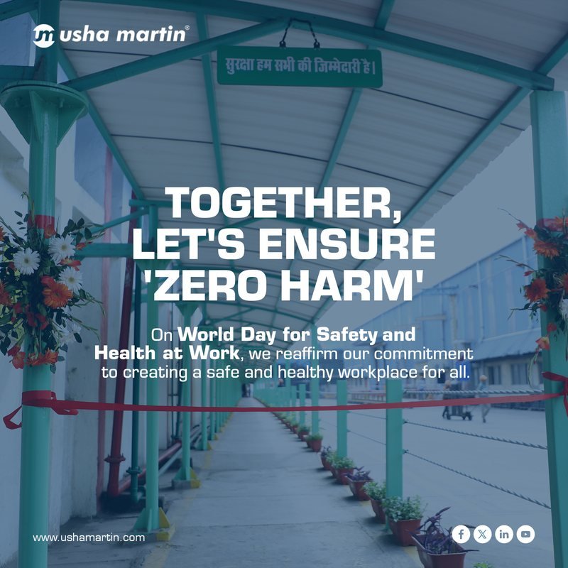
A custom stall that turns the brochure system into a walk-through experience, with product displays, hero graphics and meeting space.
Case study · Product brochures
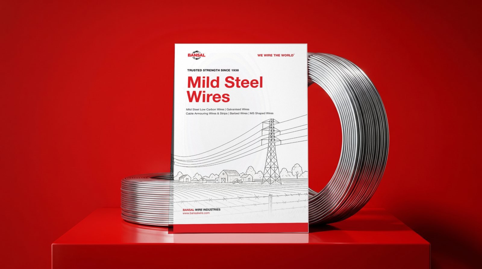
Trusted strength since 1938. Four product brochures for one of India's largest steel wire makers.
Each product line gets its own hero image while a fixed red frame, typographic grid and "We wire the world" signature keep the series recognisable on any desk or trade stand.
Company story, global presence and the product range come first. Then one spread per product with applications, specifications and packaging, so a buyer who knows one brochure can find anything in the other three.
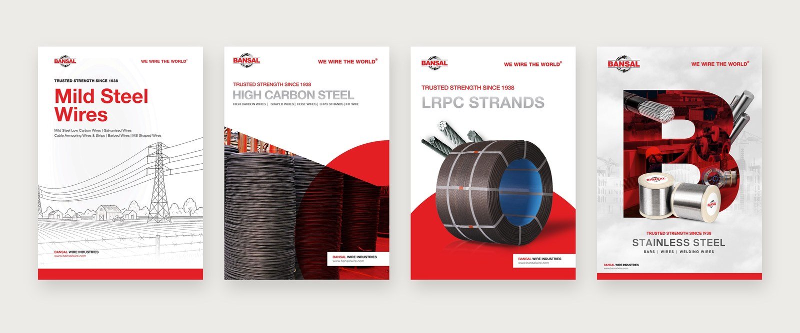
Pick a title, then flip through it spread by spread, just as it prints. Use the arrows, tap either page or swipe.
Case study · Product brochure
High performance ropes, delivered. A catalogue for steel wire ropes used in cranes, mining, marine and elevators.
Full bleed photography opens every application, from lifting and shipping to elevators, each with a single line on what the rope has to survive. Specification spreads follow with rope constructions and clean, repeatable tables.
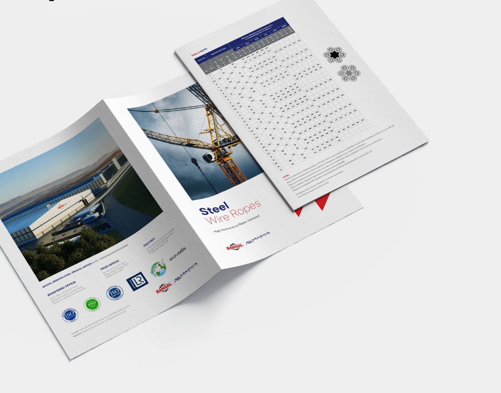
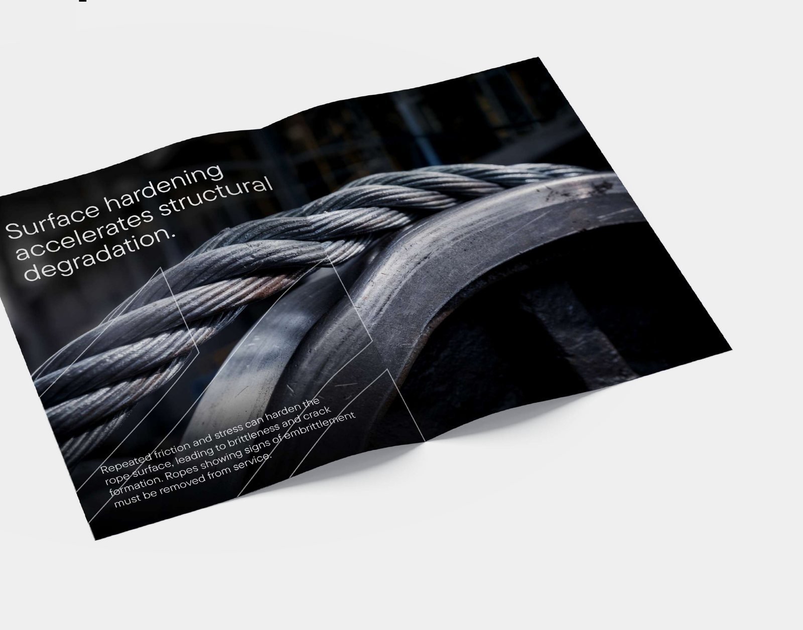
Use the arrows, tap either page, swipe or use your keyboard.
Case study · Product brochure
Gives concrete the strength of steel. A product brochure for SHAKTIMAN steel fibres.
A simple "how steel fibre reinforced concrete works" explainer comes first, followed by one page per fibre type, application stories from tunnels to airports, and a sustainability section.
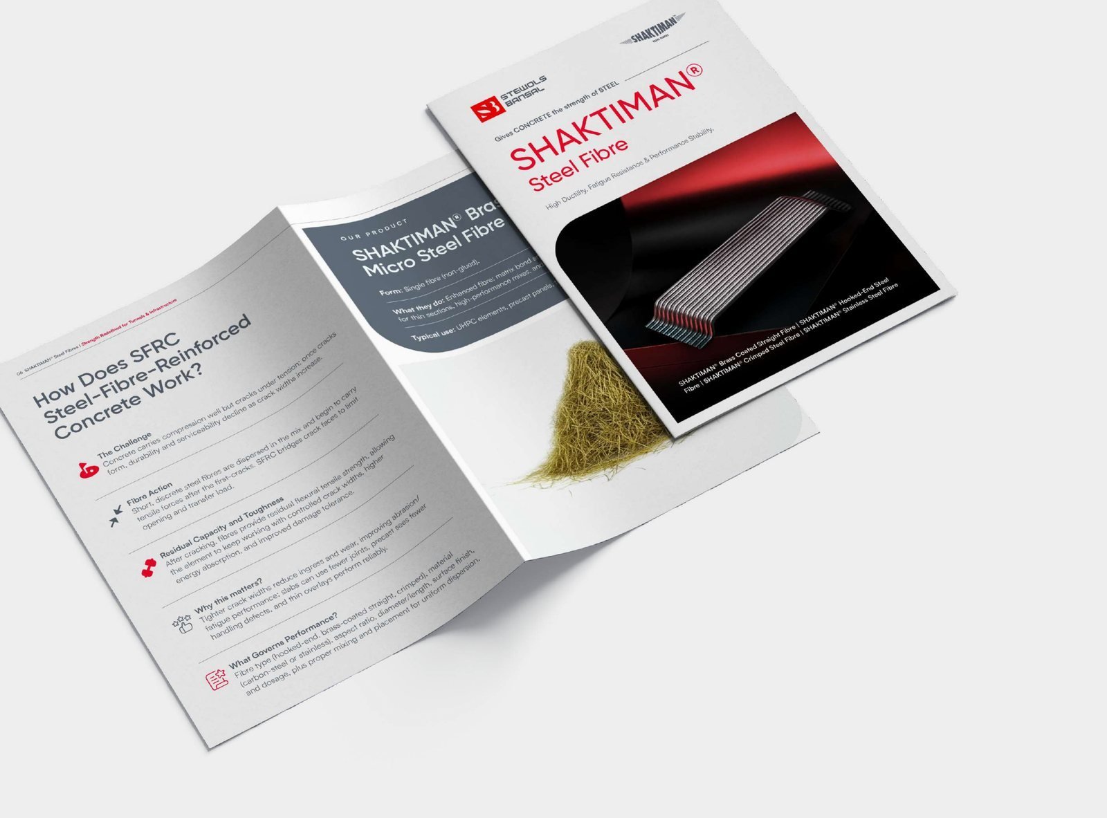
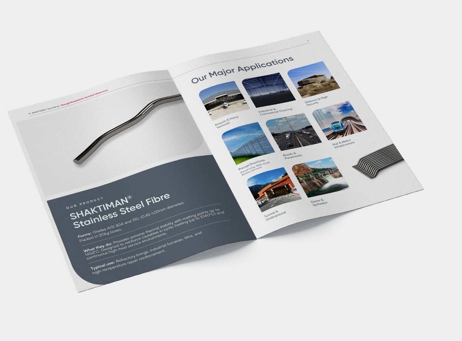
Use the arrows, tap either page, swipe or use your keyboard.
Case study · Reports, white papers, LinkedIn
Strategy consultants with a lot to say. We make sure the research reads as sharp as it thinks, in print and on the feed.
Each report gets a conceptual cover image, then a repeatable system of section openers, key takeaway boxes and a chart language built on Redseer red.
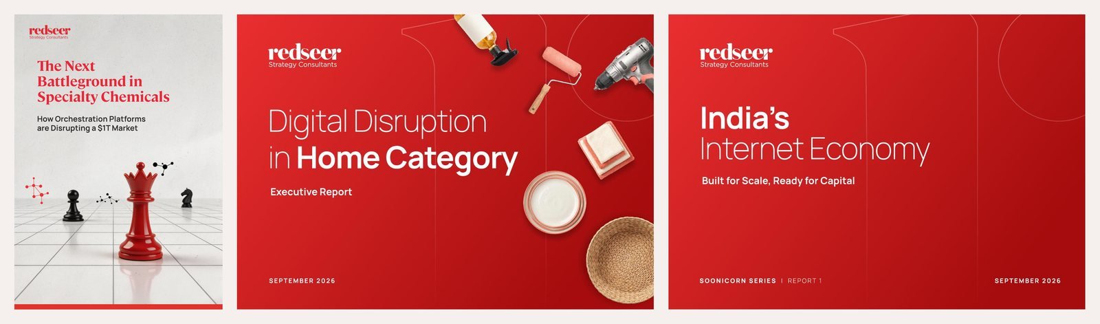
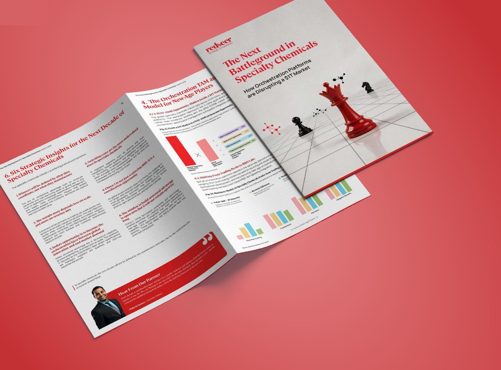
Pick a title, then drag or scroll through every page.
New-age brands, capital supply and routes to value, in 27 slides.
Market sizing, category deep dives and investor insight.
How orchestration platforms are disrupting a $1T market.
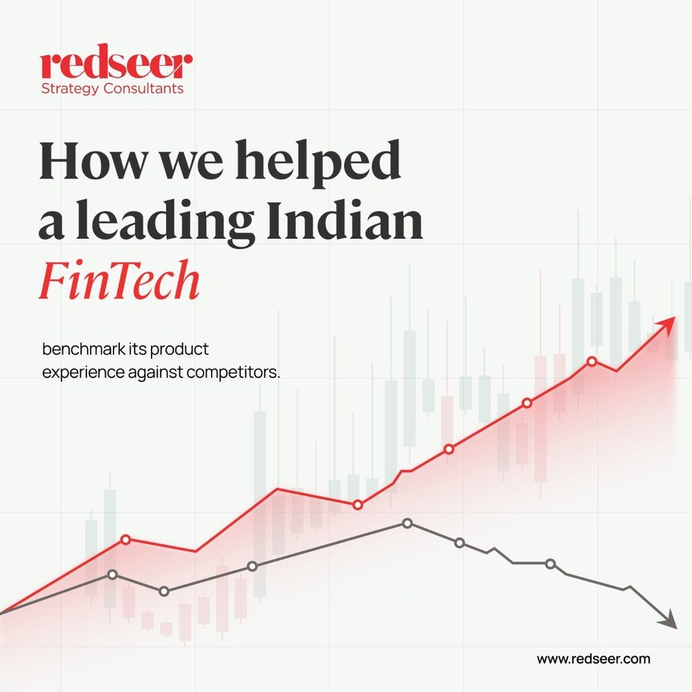
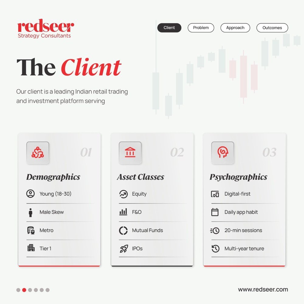
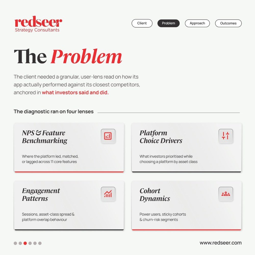
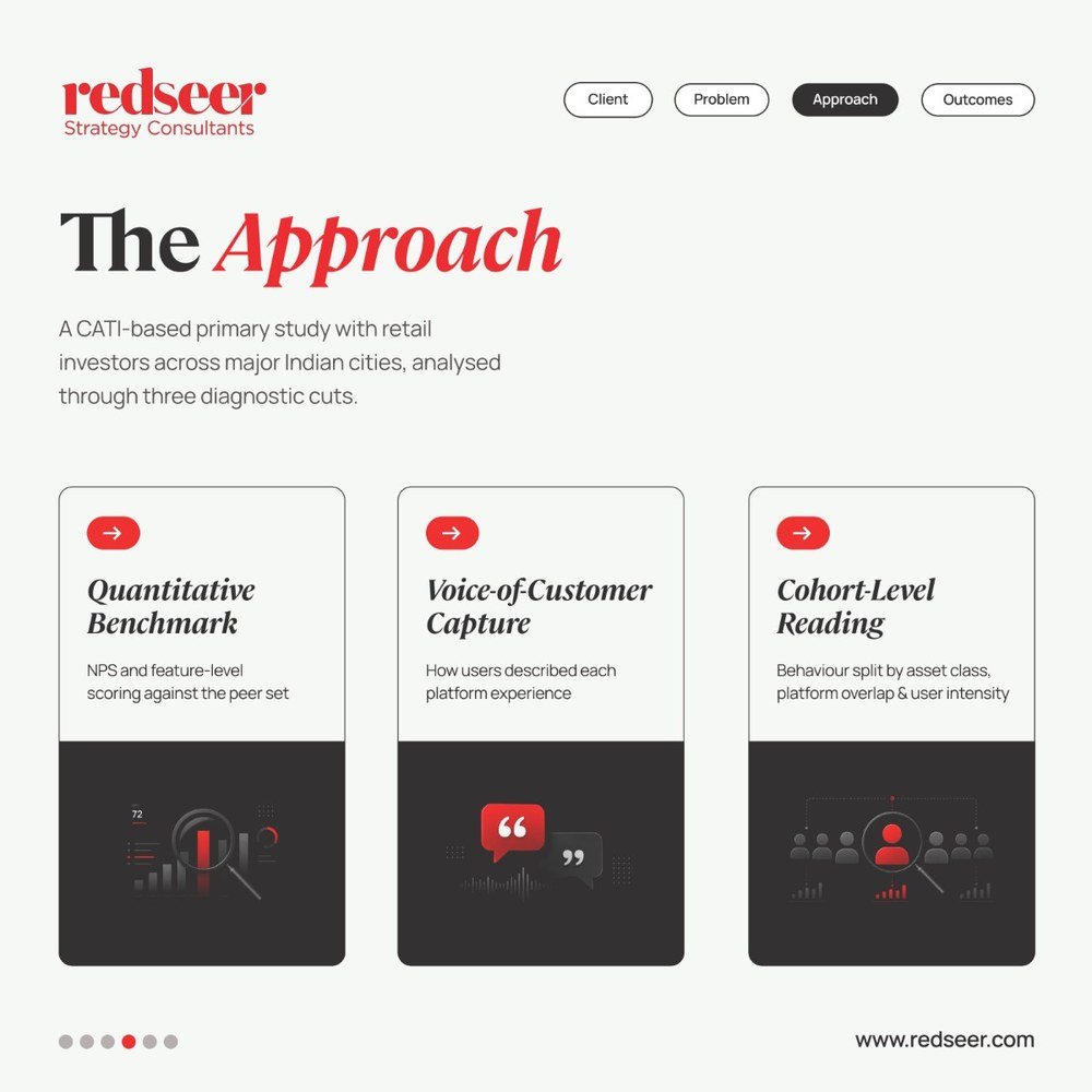
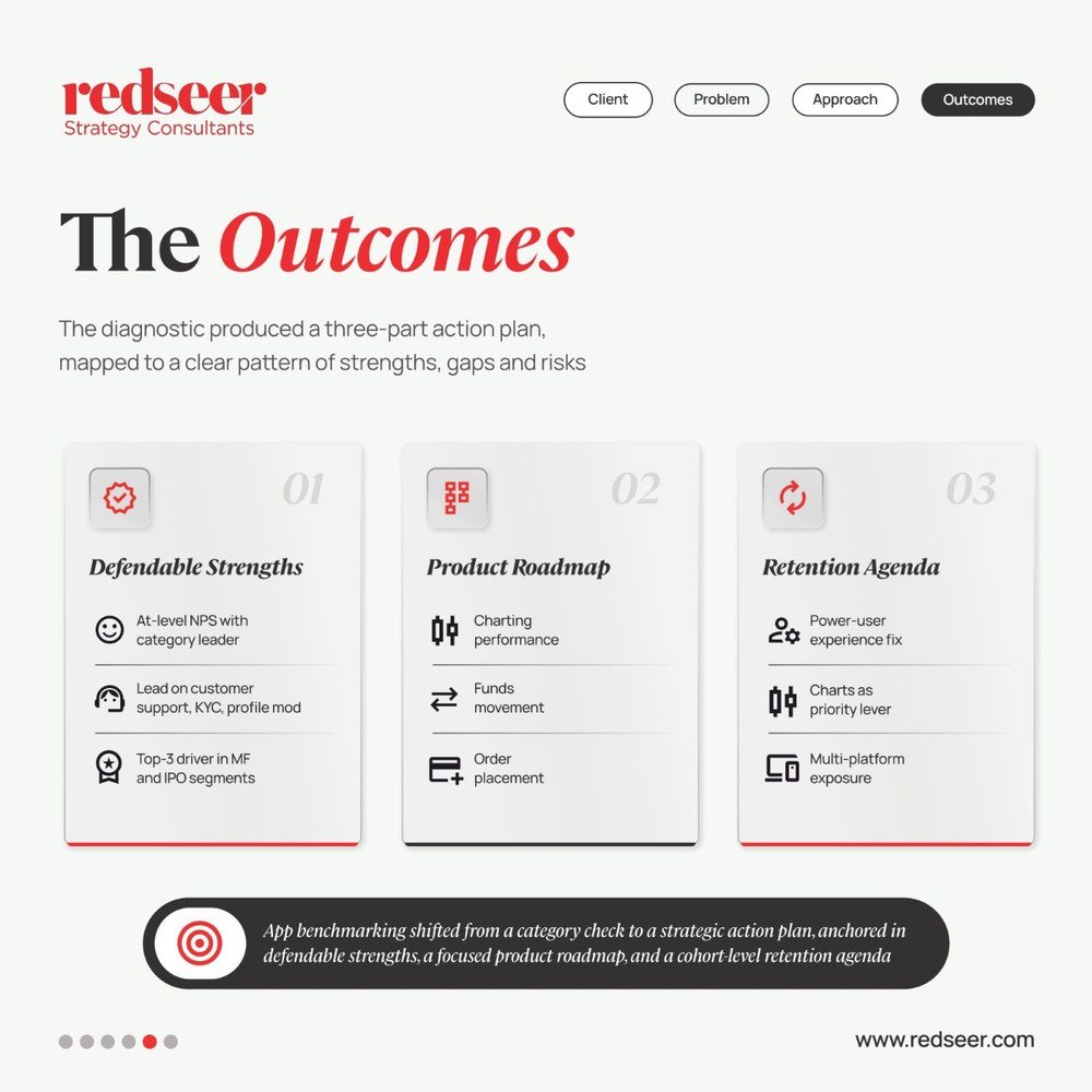
We turn Redseer's case work and research into LinkedIn carousels: a sharp hook, then client, problem, approach and outcomes, each on its own slide with chip navigation that shows readers exactly where they are.
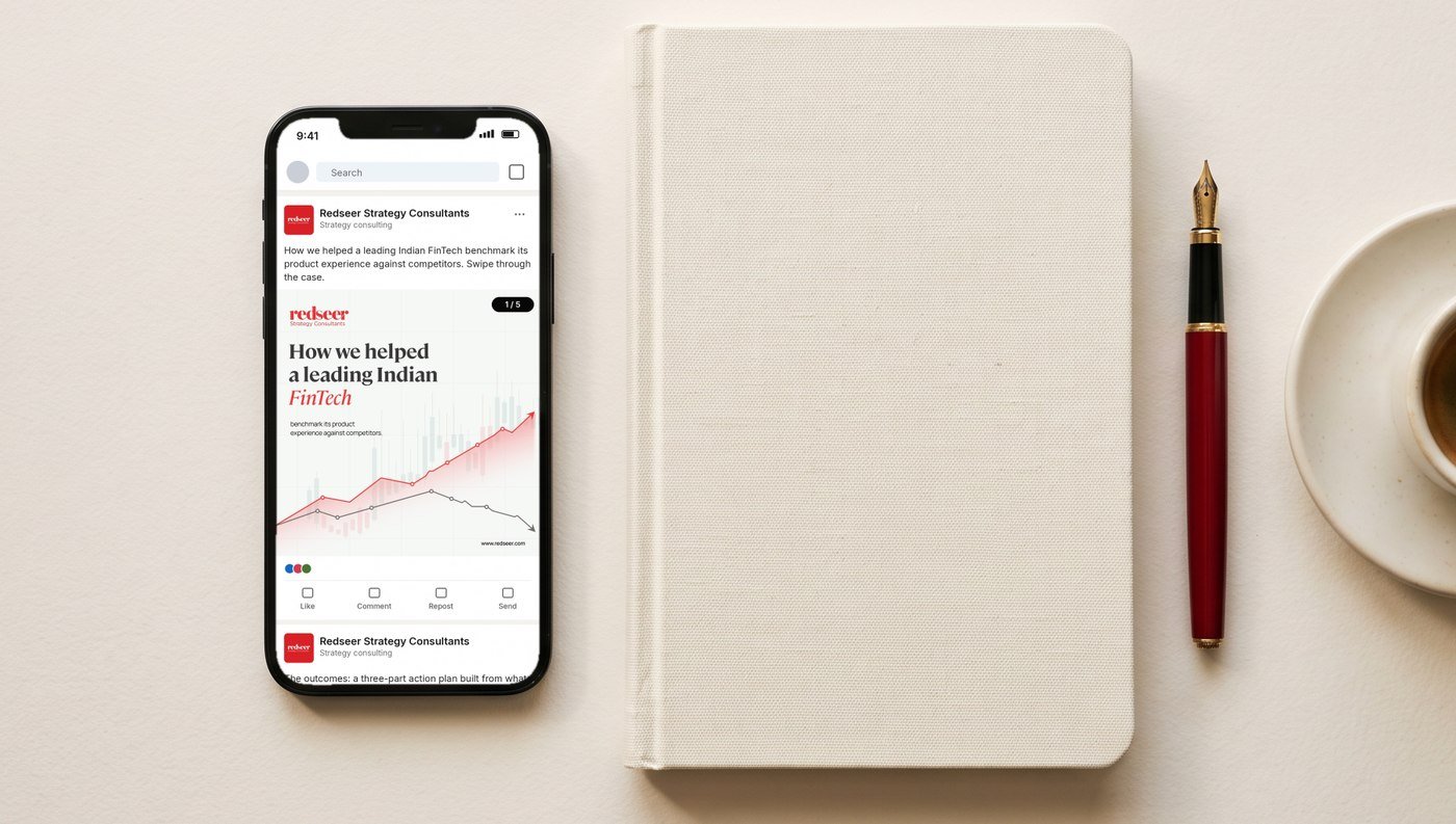
Carousel · How we helped a leading Indian FinTech
Case study · Brand identity
Unearth the extraordinary. Three identity routes for a premium granite and stone house.
Every route was stress tested on the same applications, so the client could compare ideas, not presentations.
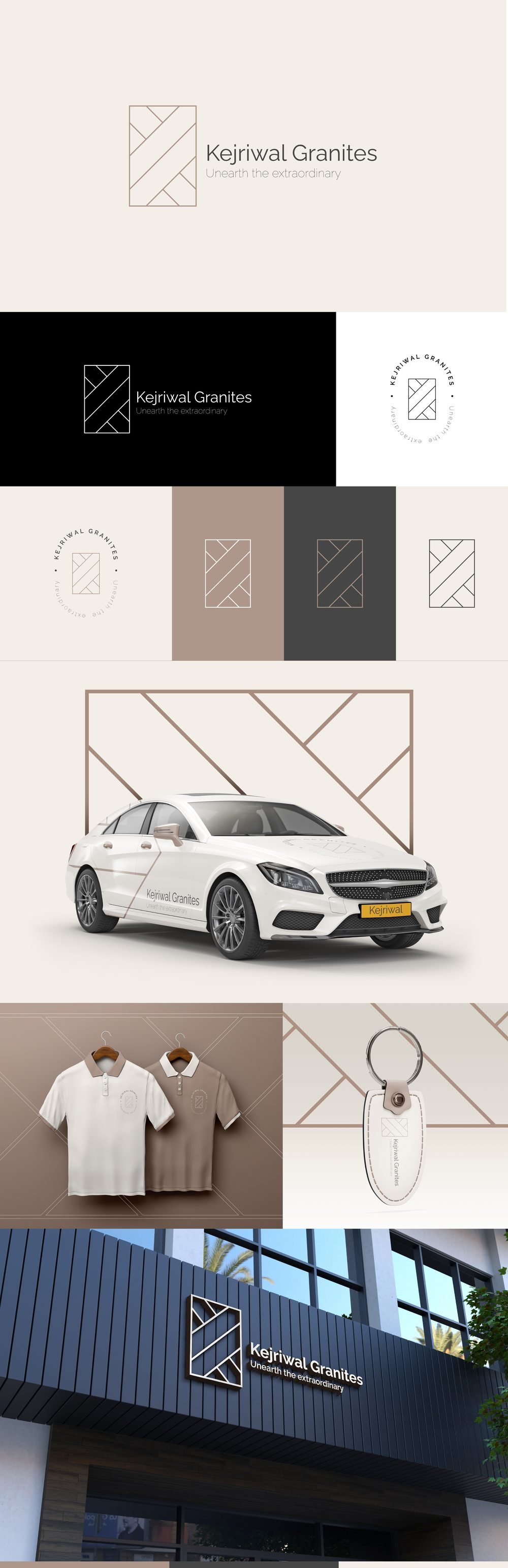
A monogram drawn from the cut lines of a stone slab. Quiet, architectural and warm, in sand, taupe and charcoal.
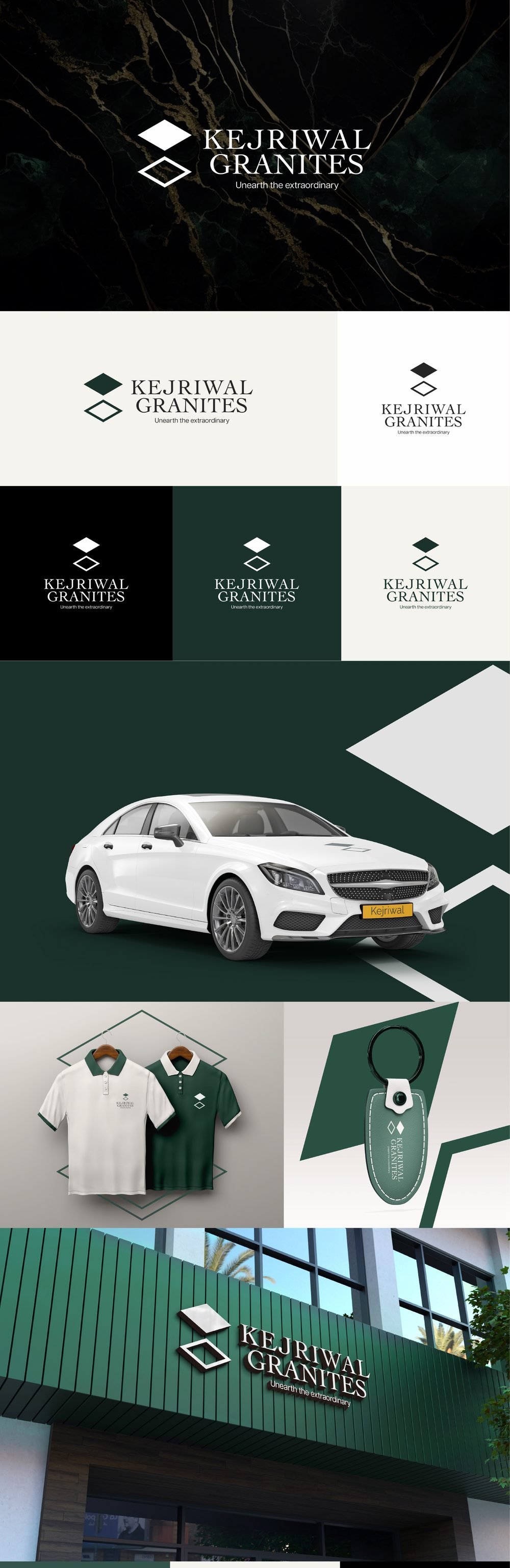
Two stacked diamonds, like polished slabs catching light. Deep green and black marble for a confident, heritage feel.
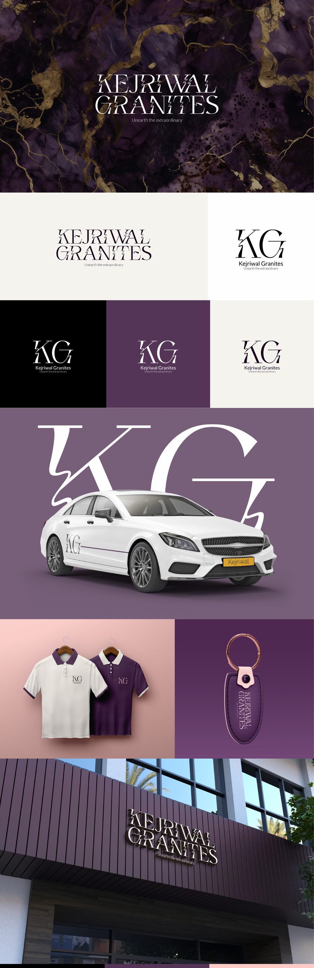
A high fashion serif with a KG monogram and violet marble with gold veins. Built to feel like a luxury label.
Case study · Brand identity
A quiet, confident identity for a taxation and business accounting practice on Australia's Gold Coast.
The monogram folds the A of Aziz into the M of Malik, using the same thin, even strokes as the wide, spaced out wordmark. It reads as established and precise, and it holds up just as well as a blind deboss on navy cotton stock as it does in print.
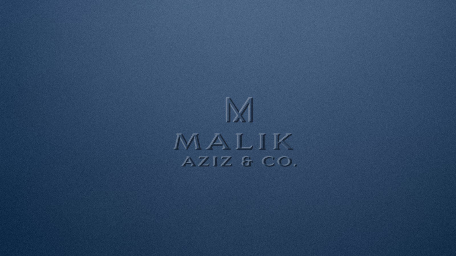
We explored the identity in forest green and midnight navy, each as a wordmark, a full lockup and a standalone monogram, so the client could see how the brand would behave from a letterhead down to a profile picture.





Matte black business cards carry the monogram on one side and a clean, centred contact block on the other. The letterhead keeps the logo small and lets an oversized, hairline M sit quietly in the background.
Spec work · Social campaign
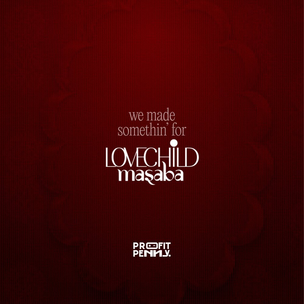
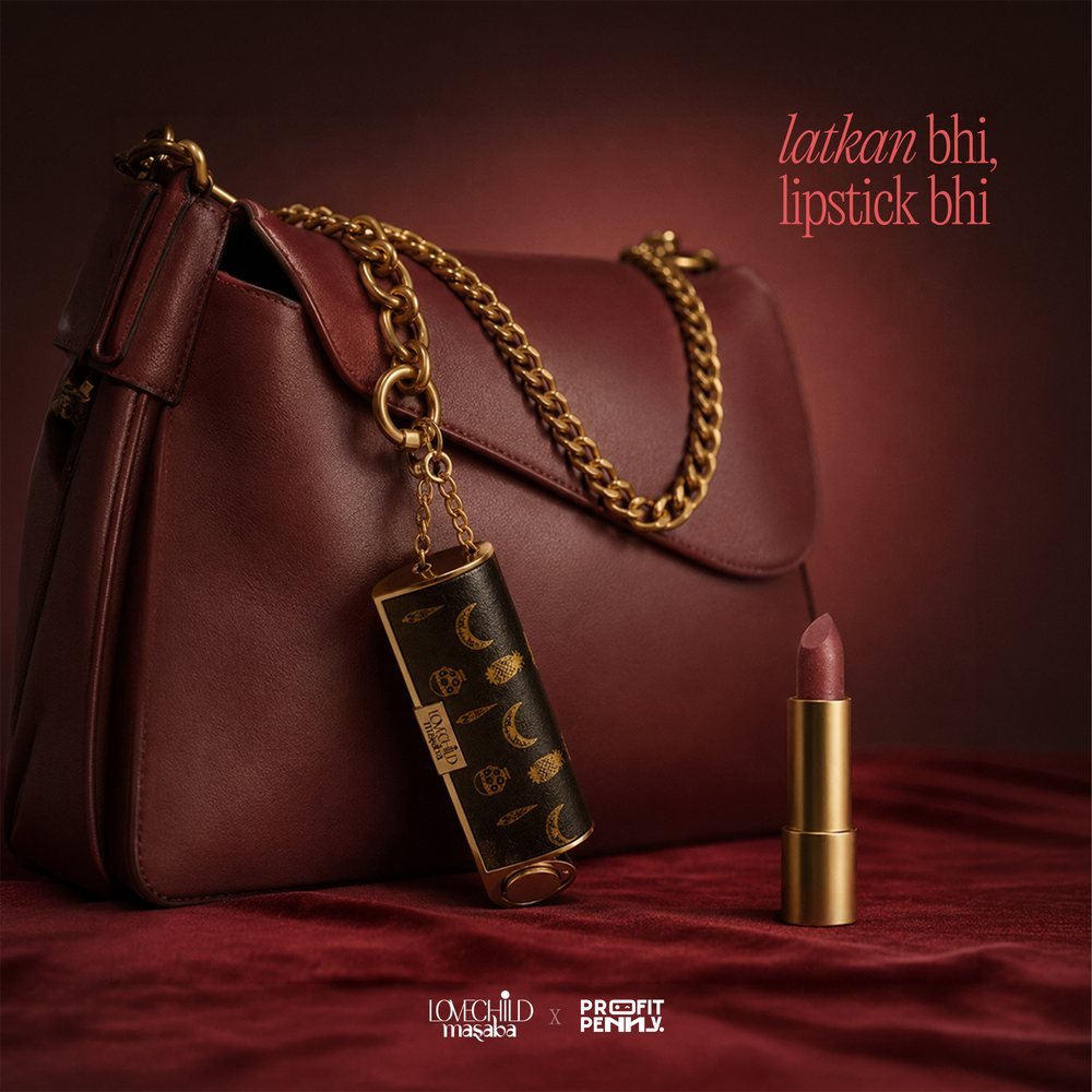
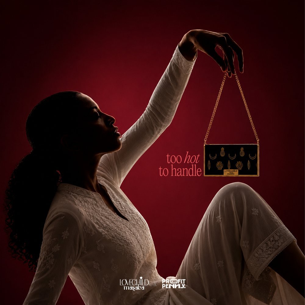
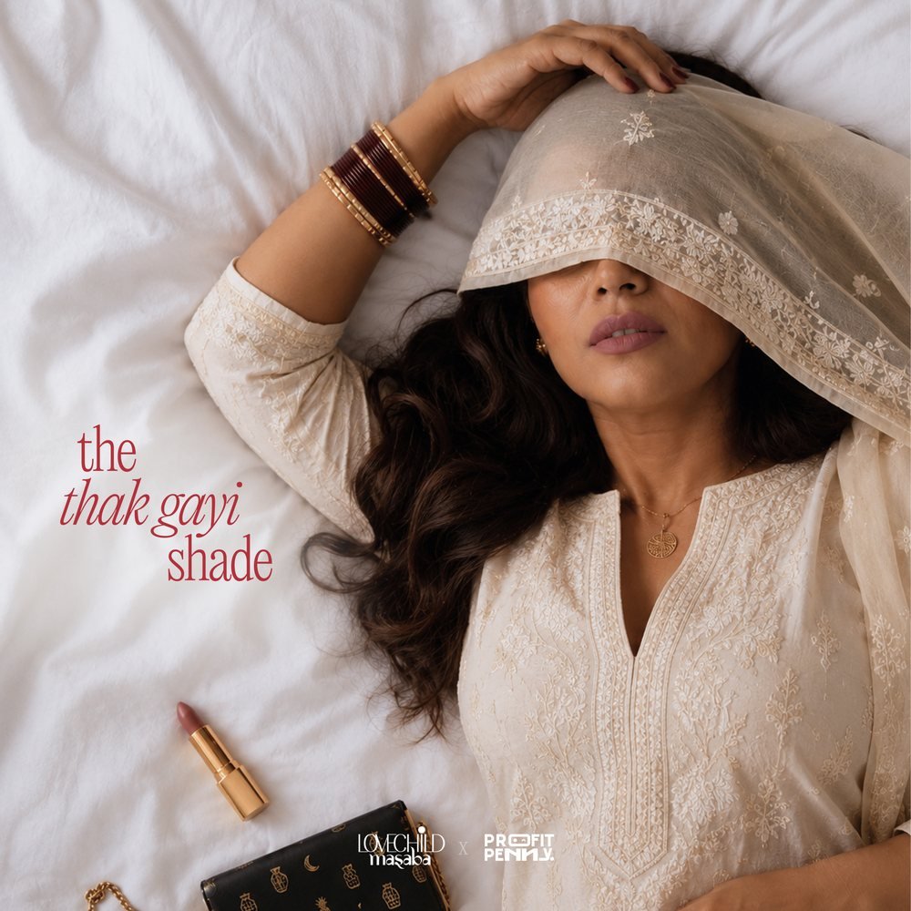
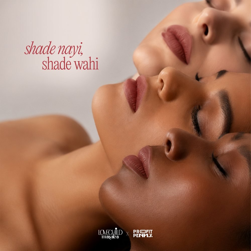
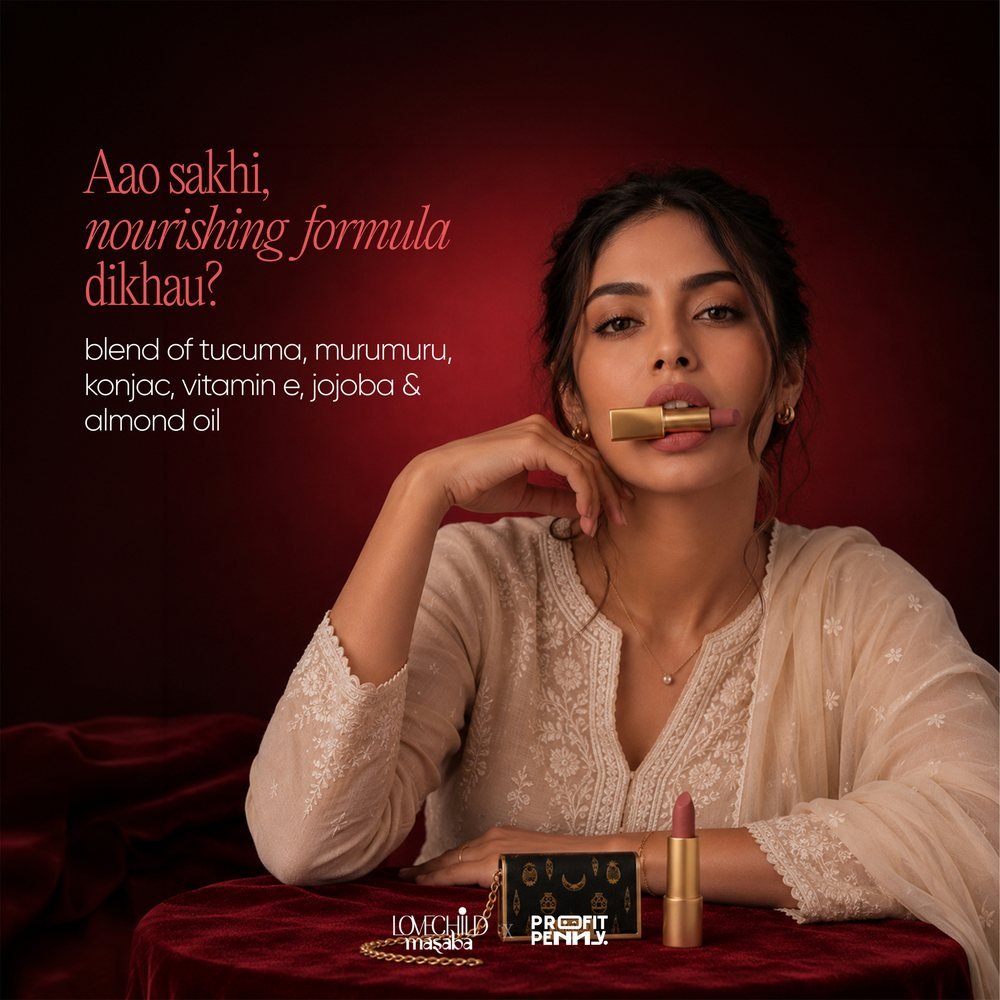
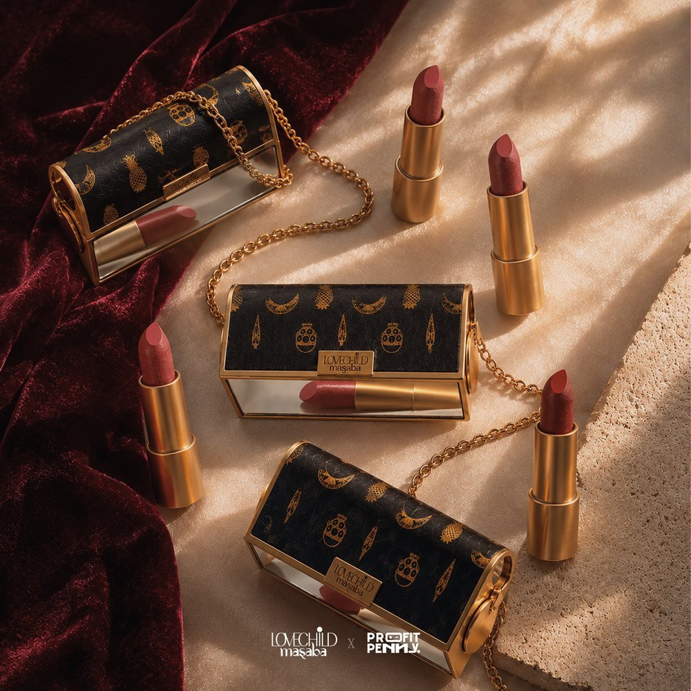
We made somethin' for Lovechild. A launch campaign for a lipstick in a heritage-inspired case.
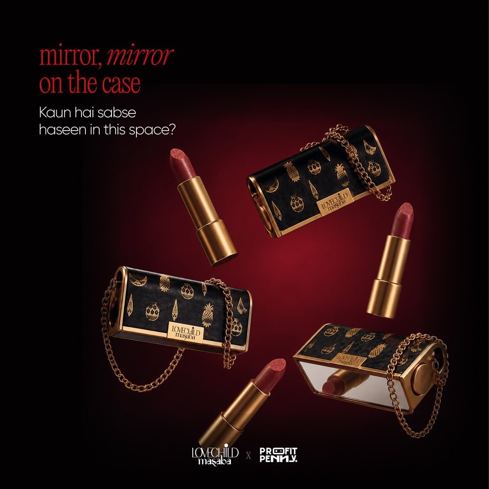
Moody product stills, portraits and flat lays in deep red, with playful Hinglish lines that sound like the brand talking to a friend.
Spec work · E-commerce
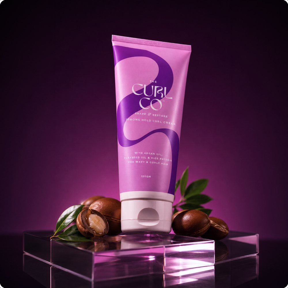
Curly hair care, finally shown the way it deserves. A self-initiated redesign of the brand's marketplace listing images.
Plain packshots became styled hero images, ingredient stories, how to use steps and a curl type guide that answers shoppers' questions before they ask.

Trusted by
Listed manufacturers, consultancies, institutions and consumer brands across India and beyond.